university / landing page
Boosting Sales by 15% with Compelling Landing Page Design: Vanderbilt Holiday Catalog
Gearing up for the holidays, Vanderbilt University found the perfect opportunity to promote their merchandise catalog in a timely and on-brand fashion. The challenge: to create a conversion-focused landing page design that felt appropriate for high academia and enhanced the institution’s esteemed image, while still making the most out of this crucial commercial moment.

Background
Nestled in the heart of Nashville, Vanderbilt University has stood as an emblem of academic excellence since its founding in 1873. With a rich history and commitment to building an enduring brand, Vanderbilt sought to amplify its presence in their alumni and faculty members’ lives through a captivating holiday marketing campaign promoting their merchandise.
Recognizing the challenge at hand—to leverage design to tastefully showcase the university’s merchandise catalog during the festive season—our creative process unfolded as a true partnership. Led by our design experts, Vanderbilt entrusted our creative marketing agency to strike the delicate balance required for a prestigious institution to venture successfully into the realm of holiday promotions.
What we did
Oak Theory’s Contribution
Instead of merely riding the festive wave, our aim was to enhance the university’s brand significance for alumni and faculty all year round, showcasing the institution behind the Vanderbilt Holiday brand. We wanted to achieve this emotional impact by creating a user friendly digital experience that truly felt like an online version of the original paper catalogs—a nostalgic nod at a cherished shared memory.
Through a purposeful fusion of conversion-focused design and creative storytelling, we crafted a memorable marketing campaign engineered to resonate long after the bells stop jingling.
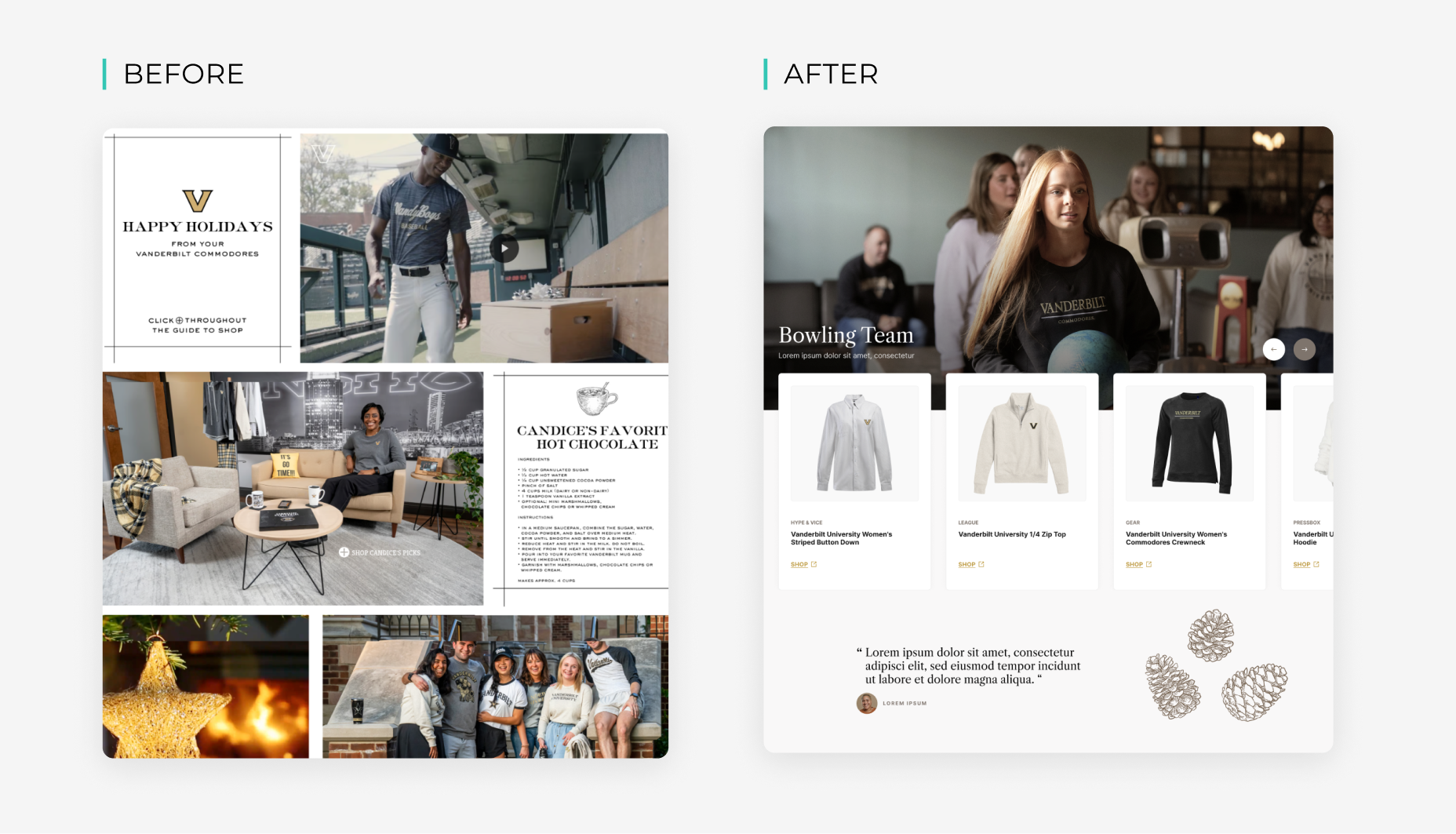
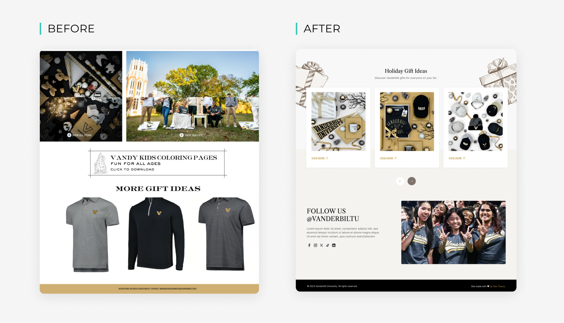
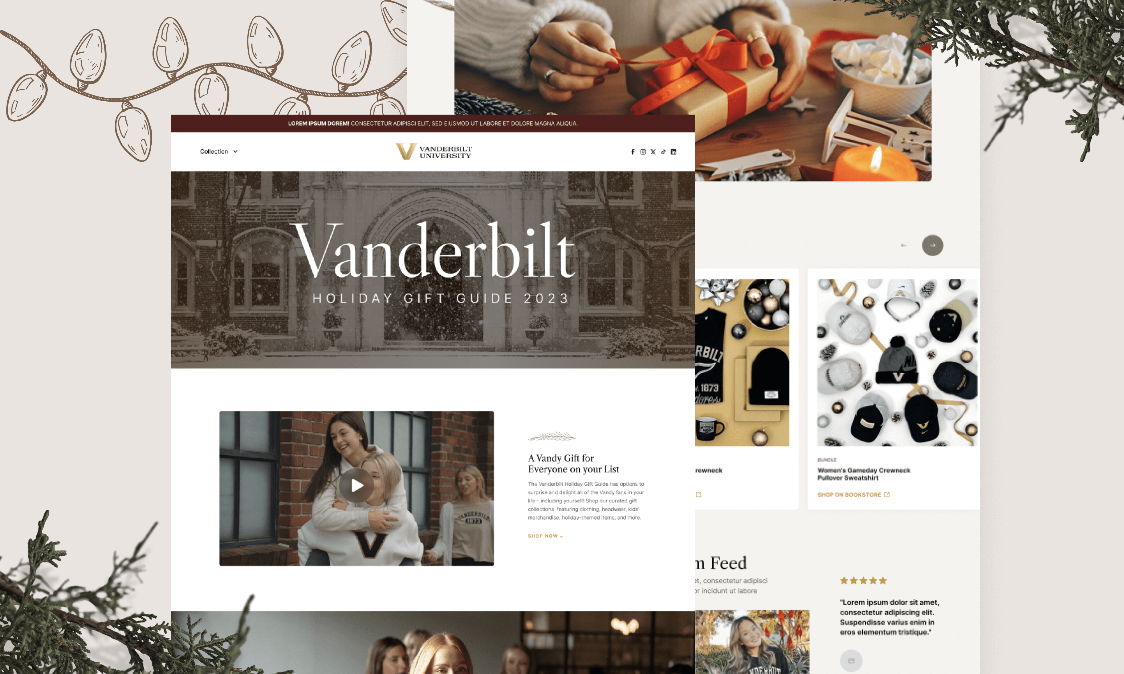
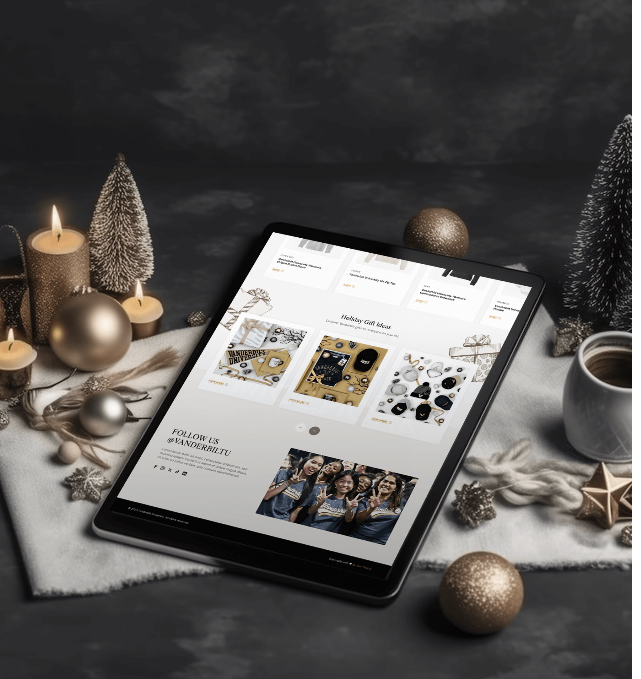
Tasked with orchestrating a 7-week marketing campaign, the focus extended beyond merely directing online traffic to cultivating high engagement on the webpage and stimulating conversions. We wanted the design to read as a clutter-free catalog page, accentuating product imagery while cultivating a cohesive, straightforward, and engaging user experience.
This visual welcome sets the stage for a rich and inviting user experience. At the heart of the landing page is a hero lifestyle video that subtly hints at the university’s core values. Interweaving the merchandise with shots of the university’s own diverse community wearing the merchandise in recognisable campus hangouts, the landing page fosters a sense of personalisation and relevance.
Complemented by a cheerful and slightly more informal tone, drawn illustration accents create a digital space that feels like a handcrafted holiday card. Testimonials from students and faculty members further enhance the personal connection, making the landing page feel deeply individualized.
“After years in Purchasing working with a bunch of vendors across various fields—seriously, it was a lot—it’s not easy for me to be wowed by a vendor. But Oak Theory managed to do just that!” — Edward Kinney, Purchasing at Vanderbilt University
The Result: A 15% Uptick in Sales
The results spoke volumes, as the university experienced heightened engagement, substantial traffic, and boosted conversions through the catalog landing page. Our partnership not only elevated Vanderbilt University’s brand presence during the high-stakes holiday period, but also laid a foundation for sustained brand impact and resonance into the new year and beyond.
what we made


before and after
