UNIVERSITY / web design & Development
Transforming Vanderbilt University's Digital Presence with Strategic Higher Education Website Design
How Oak Theory Unified Vanderbilt University’s Safety and Transportation Sites with Effective Educational Website Design


About
The Challenge
Vanderbilt University’s Safety and Transportation websites were fragmented across multiple pages, resulting in a confusing and inefficient user experience for users seeking essential safety and transportation information.
What We Did
- Content Audit Workshops
- Educational Website Design & Development
- Educational Website Copy Refresh
- Sitemap Audit & Website URL Mapping
Our Approach
Effective marketing for higher education often requires close collaboration with key stakeholders. Understanding this, we engaged over 15 stakeholders, including the police chief and representatives from various departments, to ensure their needs and expectations were aligned. Feedback from these stakeholders was crucial in helping us quickly identify the most logical solutions for the VU team and community, allowing us to avoid potential missteps. This collaborative approach enabled us to focus on the overall website design, aligning the unique requirements of Vanderbilt University with best practices in digital marketing for higher education.
Our primary goal was to create a website that consolidated Vanderbilt University’s public safety and transportation resources into a cohesive, user-friendly platform. By merging multiple sites, we aimed to enhance accessibility and interaction, especially during emergencies.
We also sought to eliminate outdated and redundant content, ensuring all information was current, relevant, and easy to navigate. This involved developing a new navigation structure that improved the overall user experience, making it easy for visitors to find the information they needed quickly and efficiently.
Finally, our objective was to strike a balance between providing comprehensive information and avoiding content overload. By carefully curating content, we aimed to offer essential details without overwhelming users, adhering to the principle that “less is more” to better serve the university community.
Project Deliverables: Effective Design for Educational Websites
- Public Safety Website Consolidation: We created a main Public Safety site that included two critical pillars — Police Services and Emergency Preparedness — integrating tools like the university’s VandySafe App and AlertVU. This site was designed to retain the primary Vanderbilt University URL and serve as a central hub for safety information.
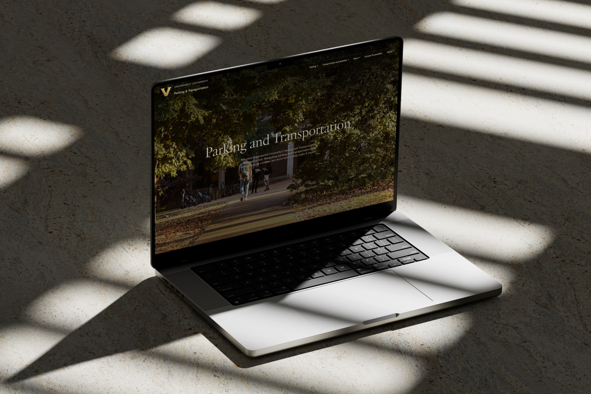
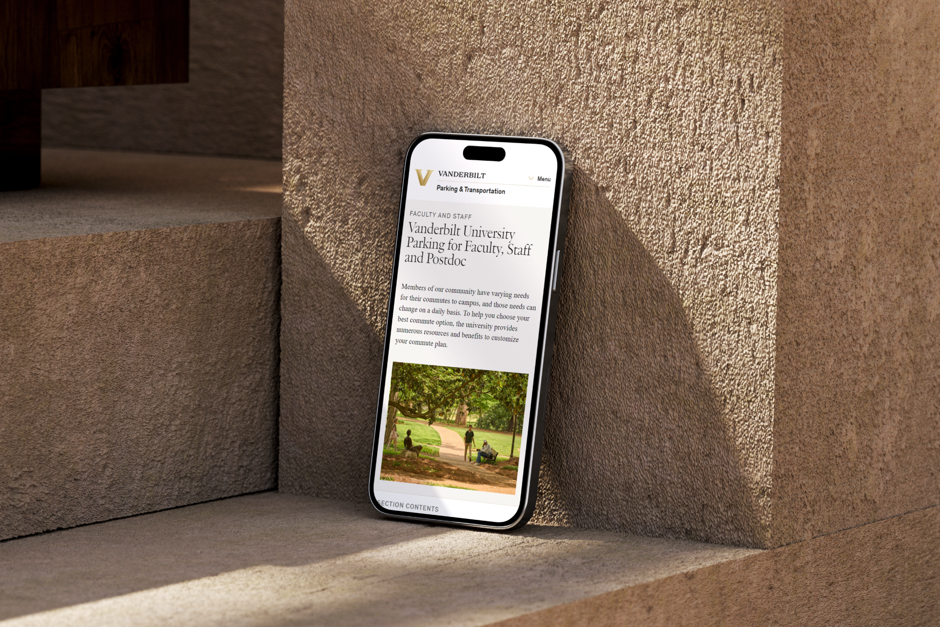
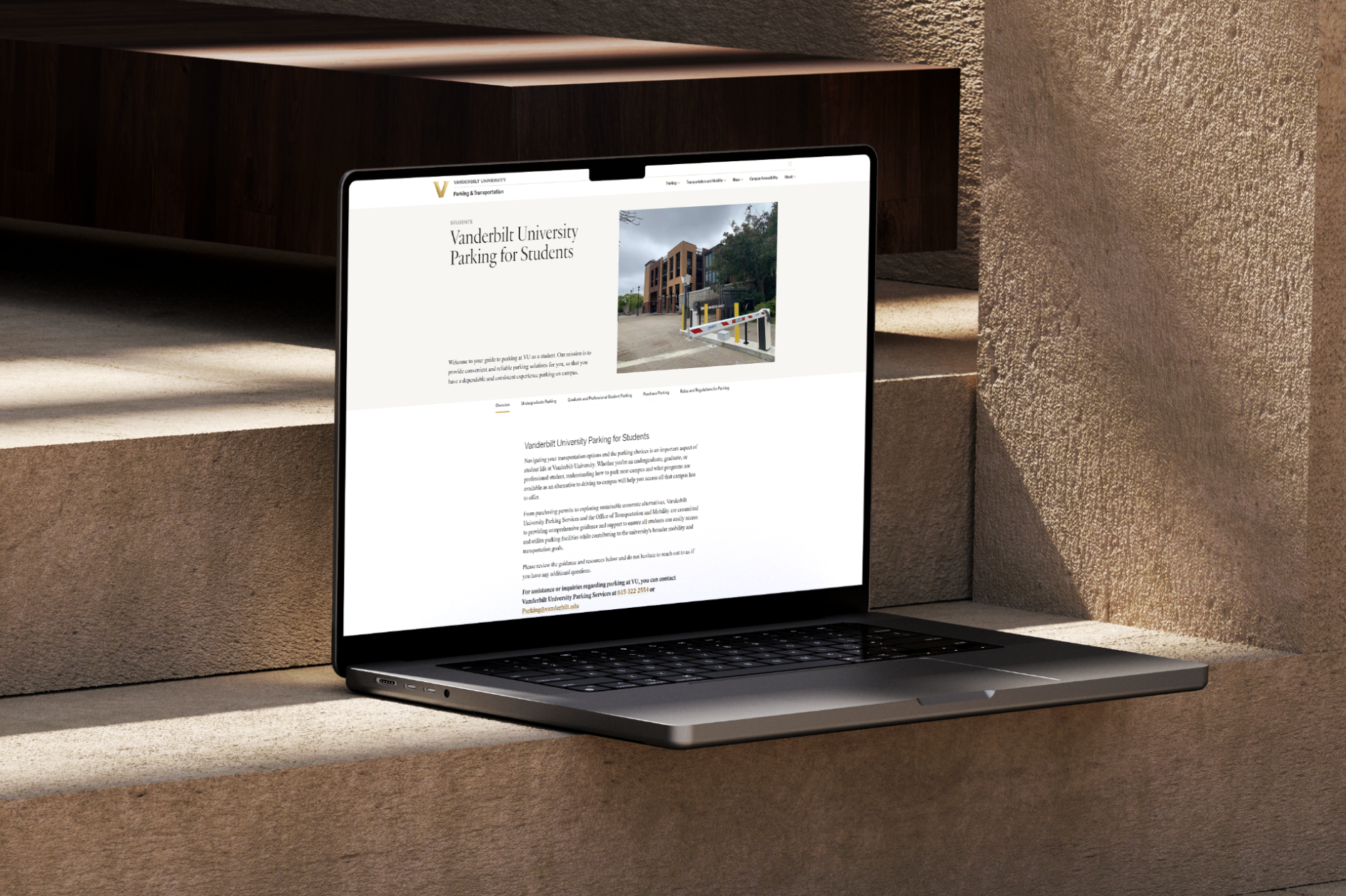
- Traffic, Parking, and Transportation Website Creation: We developed a separate site for Traffic, Parking, and Transportation, aligning with the university’s MoveVU initiative. This site consolidated related information into a centralized, easy-to-navigate platform, effectively distinguishing between public safety and transportation resources.
WORDS FROM OUR CLIENTS
“The new site looks fantastic and will be a gamechanger for the whole Vanderbilt community. I can’t wait for people to start using it.”
“Oak Theory managed an extremely complex and high-visibility website migration for the Vanderbilt Digital Strategies team while interfacing with over 20 internal stakeholders. From stellar project management to insightful content strategy, design, copy and development, their team covered every base and didn’t shy away from addressing the tough questions. They tackled a steep learning curve and we’re so thankful to continue partnering with them as an extension of our department.”
The results
Since launching the revamped Traffic and Parking pages, Vanderbilt University has seen remarkable growth in user engagement. Year over year, post-launch of the new site, page views surged by an impressive 117.31%, climbing from 51,536 to a staggering 111,995. The number of active users also jumped by 59.81%, with 31,350 people now actively engaging with the site compared to 19,617 previously. Even more telling is the boost in interaction, as views per active user rose by 35.74%, highlighting the enhanced usability and improved user experience.
Oak Theory’s approach to higher education website design has transformed Vanderbilt University’s digital presence, making it easier for users to access critical information. The launch of the new sites led to a noticeable boost in engagement and satisfaction, with users praising the streamlined navigation and easy access to safety and transportation resources. This intuitive design not only improved the overall user experience but also strengthened Vanderbilt’s online presence, showcasing the power of thoughtful design for educational websites. Oak Theory’s work exemplifies how digital marketing for higher education can create impactful, user-centered solutions.
WHAT WE MADE


