Crypto / branding & Website
Masa
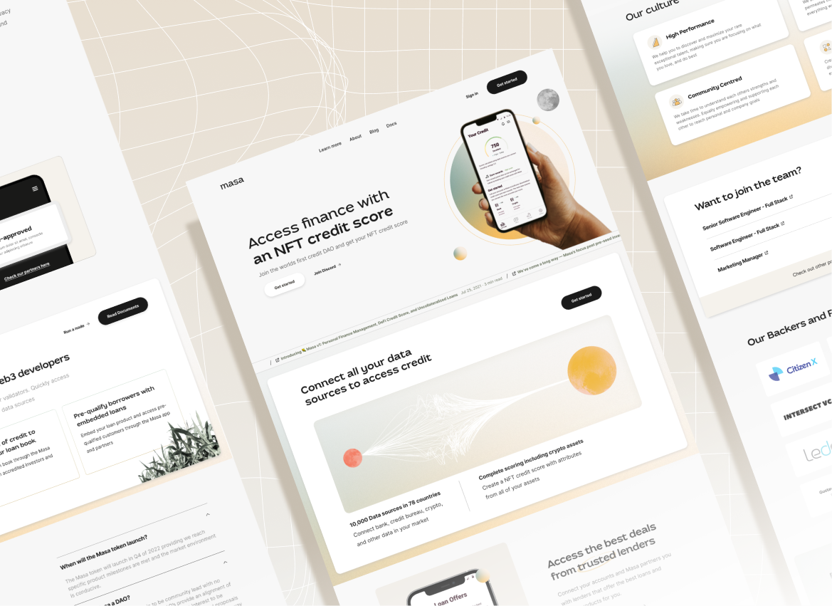
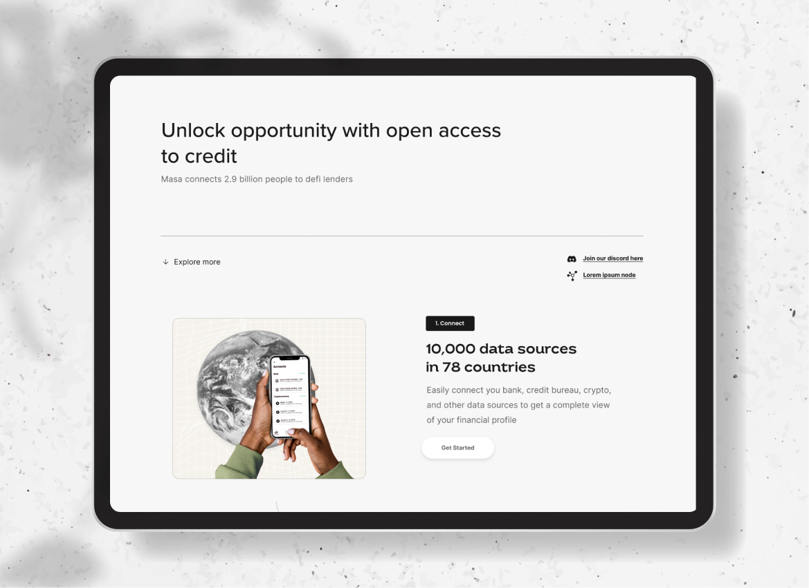
Participating as a design extension of Masa’s team, we were tasked with revamping their outdated website by hyper-focusing on their primary target audience’s needs.In this same initiative, we elevated their existing brand with updated font styles, color palettes and illustrations.


Background
Masa is a decentralized financial data platform which provides a simple user experience through which people can link, manage, and track traditional and cryptocurrency accounts to create a non-fungible credit report – allowing access to credit through fully on-chain services.
Participating as a design extension of Masa’s team, we were tasked with revamping their outdated website by hyper-focusing on their primary target audience’s needs.In this same initiative, we elevated their existing brand with updated font styles, color palettes and illustrations.
What we did
our journey together
In a startup environment, it was imperative that our communications were fluid. Having weekly standing meetings enabled flexibility for presentations or check in with the clients. Using Slack as a communication tool also allowed for quick turnarounds for reviews, approvals and required assets.
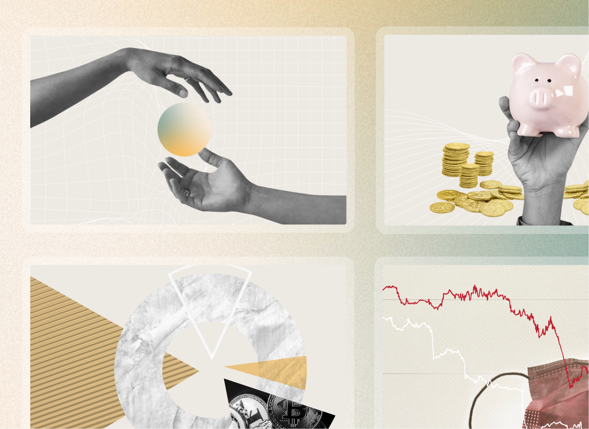
Through our multiple workshops, it was determined that the Masa visual identity needed to better encapsulate their brand and product offering. We leveraged existing elements as a foundation to push brand colors, illustrations and fonts.
An agile approach was made possible through utilizing Figma as a design tool. Understanding the client’s dev timelines, we were able to prioritize specific pages and handoff dev ready files. The handoff process was simplified using Figma.
what we made
