institute / website redesign
Institute for Global Health Sciences (UCSF)
A fresh new take on the university’s Global Health Sciences website.
Background
Institute for University of California’s Global Health Sciences has sought to be a pioneer and innovator in academic global health, with a deep commitment to improving the health of marginalized communities.
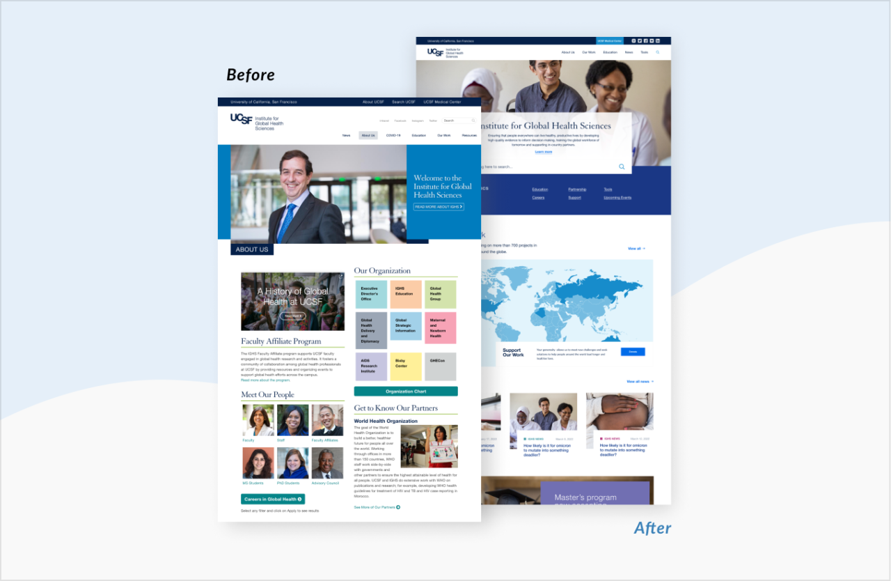
As it had been a while since the site was designed and updated, UCSF IGHS wanted to a fresh take on their department website with the focus of promoting their exceptional education programs to attract new prospect students and make their information rich hub easier to navigate for donors and visitors.
What we did
OUR JOURNEY TOGETHER (PROCESS)
Through our discovery workshop, we reviewed the current challenges with the existing site and identified the priorities for the updates by collecting the departments’ many stakeholders.
We conducted competitive analysis looking at other institutions and organizations with information heavy websites like UCSF IGHS’. We took inspiration from what seemed to be working well for other organizations into the design systems we eventually created.
Because of the many stakeholders involved in the design process, it was important for us to simplify and make a process of sending and receiving creative feedback. We leveraged Invision to make commenting and consolidating feedback easier for the client.
What we made
Better organized information architecture
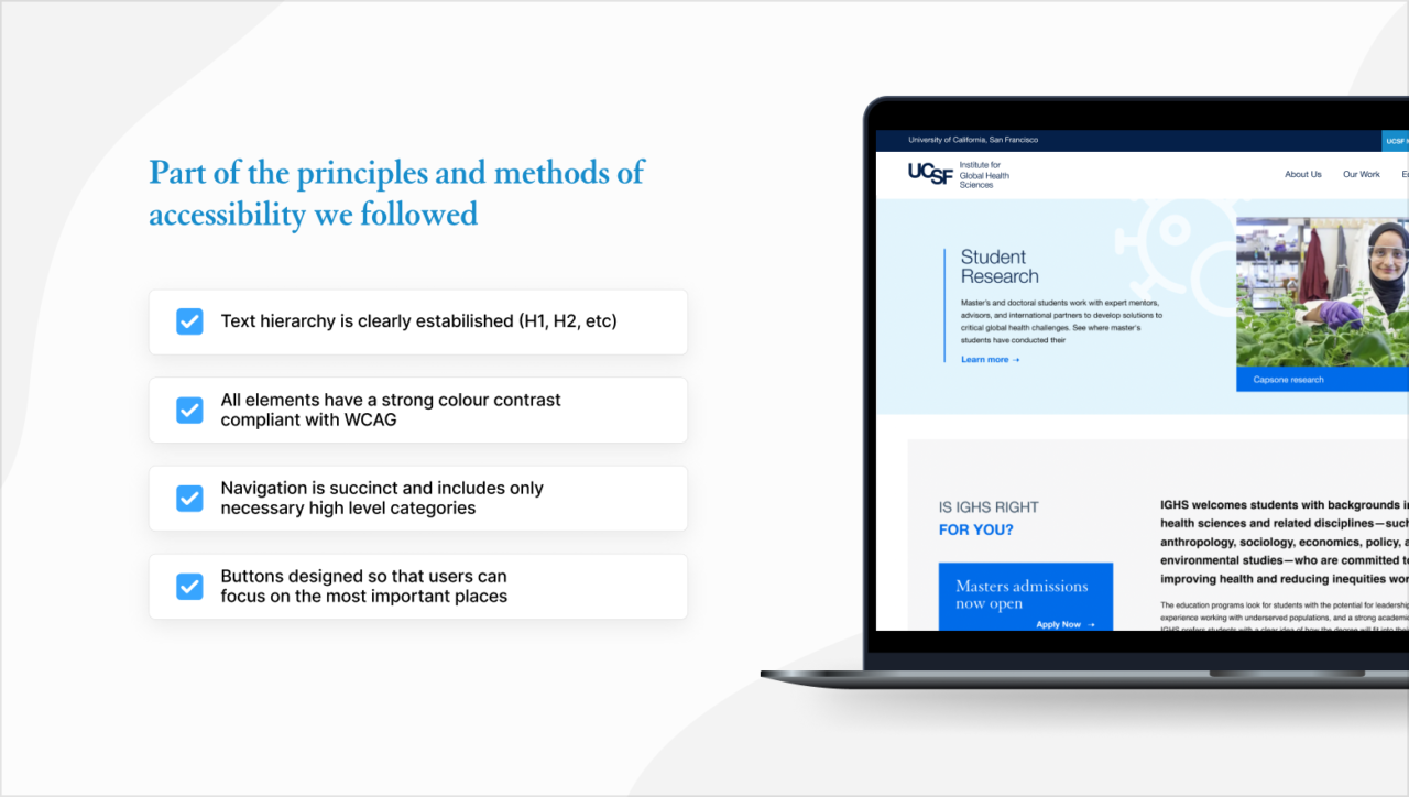
We wanted to create a layout that was visually easier to navigate – utilizing a strong image, consolidating lengthy copy and information through quick links and search functionality.
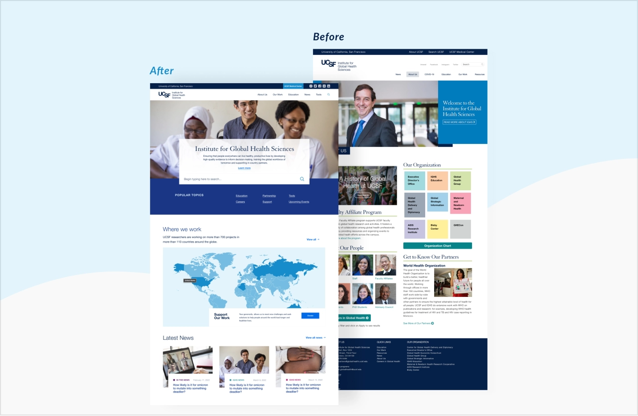
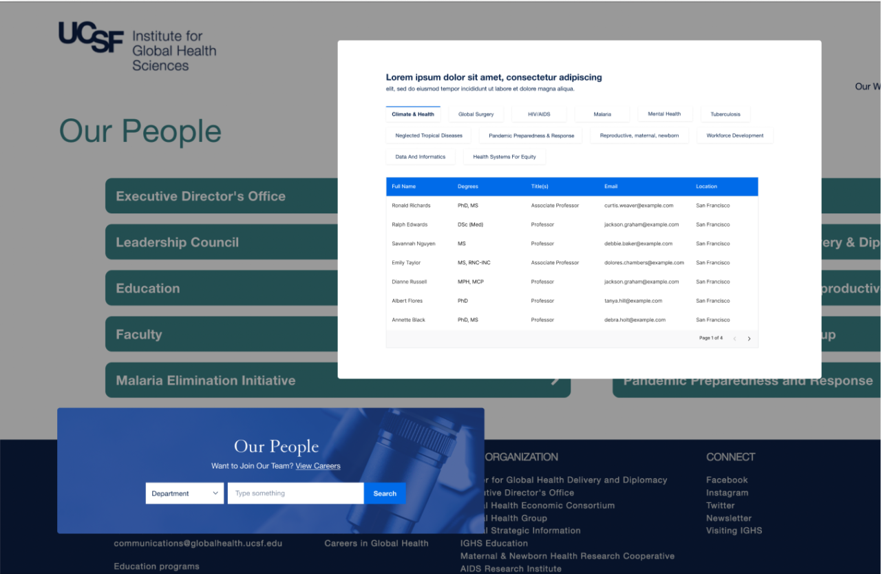
Create internal navigation (list of content) and filters for pages with a lot of content
As an information and content heavy website, we brainstormed different ways to organize the content that would be easy for the user to navigate, filter, and find what they are looking for with a few clicks.

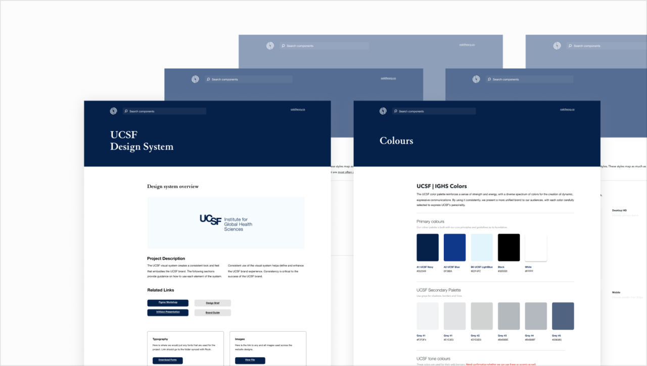
Building a design system
Working within the existing brand guidelines, we updated the branding introducing new colors and fonts improving user experience.

UI Design
For the UI stage, the most important thing for us was to maintain the consistency of the design and branding of UCSF, while improving it in every possible way. We have reviewed all versions of the UCSF sites, updated the branding and prepared a design system for our new site.
