Logo Design / brand identity
Crafting a Standout Logo Design for New York City's JFK Terminal 6
How We Developed Innovative and Versatile Logo Concepts for the Transportation Industry.

About
The Challenge
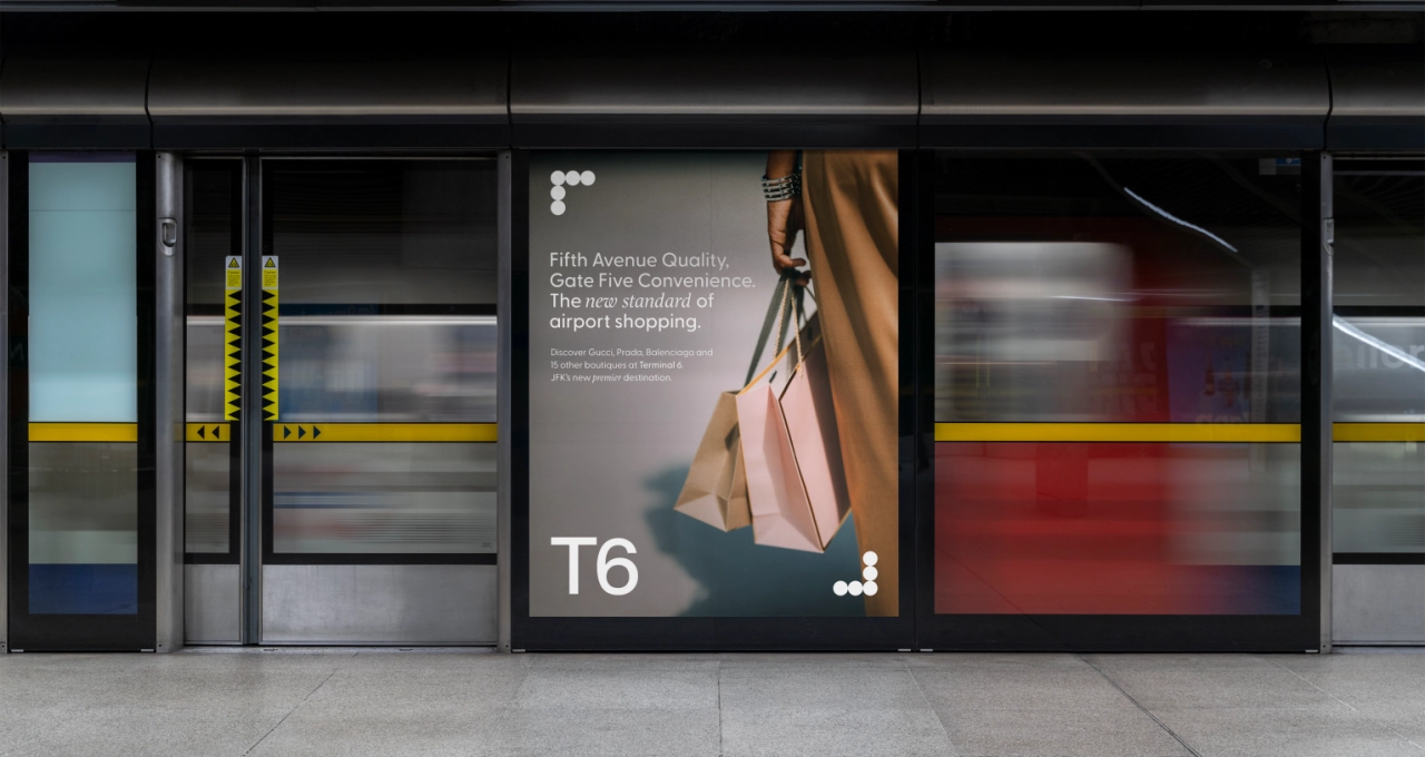
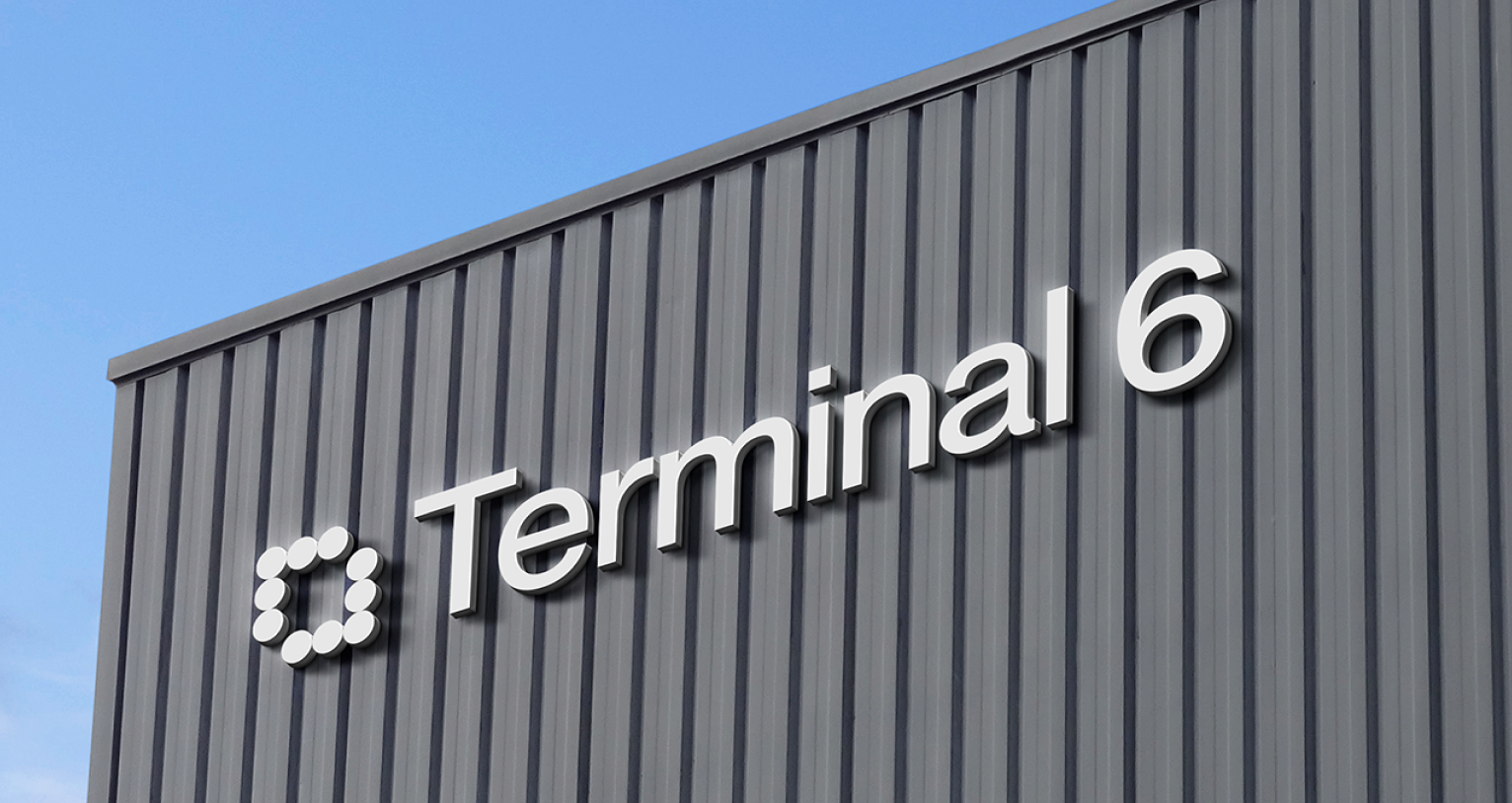
The task was clear: deliver a logo design appropriate for the transportation industry that embodied the essence of New York while seamlessly fitting into the various physical and digital environments it would inhabit.
The project required us to start with a blank canvas, pushing the boundaries of traditional transport logo design to visually match the innovation of the new T6 (Terminal 6). We needed to strike a balance between bold creativity and the functionality required for such an iconic space, ensuring the logo could integrate smoothly with other transportation industry logos while maintaining a distinct identity.
What We Did
Our Approach
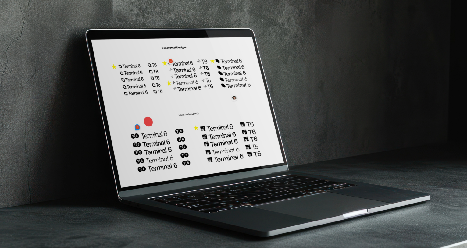
As the JFK team wasn’t entirely set on the creative direction they wanted to follow, we understood the importance of offering diverse options—especially in the early stages of the process. Oak Theory approached the project by developing six logo concepts that seamlessly merged conceptual creativity with practical functionality; each design balanced New York’s cultural essence with the practical needs of a global transportation hub. By focusing on both clarity and creative expression, we delivered a dynamic logo system that could evolve with Terminal 6 as its partnerships expanded. Above all, however, we aimed to evoke movement and connection, something we deemed essential for an international transit space.
Our key focus areas were:
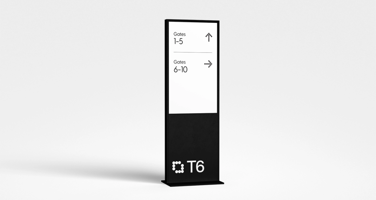
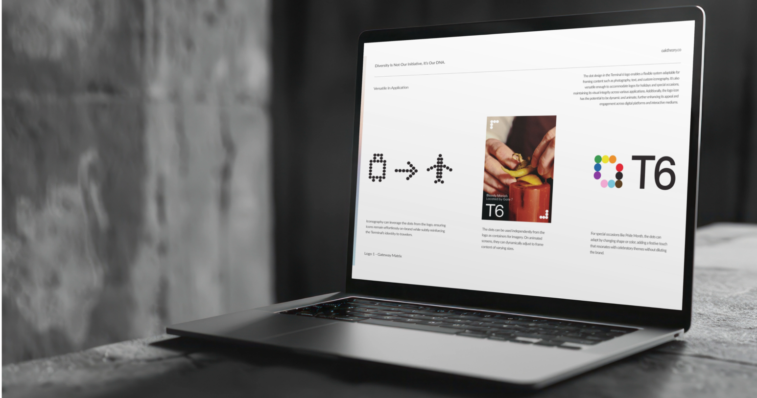
- Versatile transport logo design: Each concept had to be adaptable for both digital and physical signage throughout the terminal.
- Iconic brand identity design: We drew inspiration from New York’s skyline and architecture, infusing our designs with the cultural energy that defines the city.
- Creative branding solutions: From minimalist to bold, expressive logos, the designs needed to speak to both local and international travelers.
Throughout the project, Oak Theory worked closely with JFK’s Terminal 6 team, ensuring the designs met their evolving vision. We refined the logo concepts based on feedback, positioning Terminal 6 as a natural extension of New York’s identity. As a result, we offered the client brand identity options that could stand the test of time and offer travelers a seamless New York experience from the moment they entered the terminal.
WORDS FROM OUR CLIENTS
As the JFK Terminal 6 team expressed, “Oak Theory’s logo options were one of our team’s favorites.”
Discover Innovative Branding Solutions with a Top NYC Creative Agency
If you’re looking for a brand identity agency in New York or need expert transportation logo design, Oak Theory is here to help. Whether you’re in the transportation industry or any other sector, we can craft a stunning brand identity that sets you apart. Contact Oak Theory today and let’s create something extraordinary.
WHAT WE MADE
