B2C / LANDING PAGE
CEED
In the cannabis industry, CEED empowers Black entrepreneurs, navigating a challenging landscape with a modern and non-cliché visual identity, despite historical prejudices and discrimination in their community.


Background
When CEED approached Oak Theory, they presented a unique challenge: to craft a visual identity that not only echoed their core values — community, empowerment, and ownership — but also showcased the power of cannabis as an industry where Black entrepreneurs can thrive.
Our goal was to create an identity that would help CEED market their platform, which they’d specifically designed to inspire and connect Black entrepreneurs working in cannabis. As a creative studio that prides itself on the ability to integrate diverging perspectives into robust brands, we wanted to create a holistic identity that mirrored CEED’s essence and avoided the visual clichés that abound in the industry.
What we did
Our Contribution
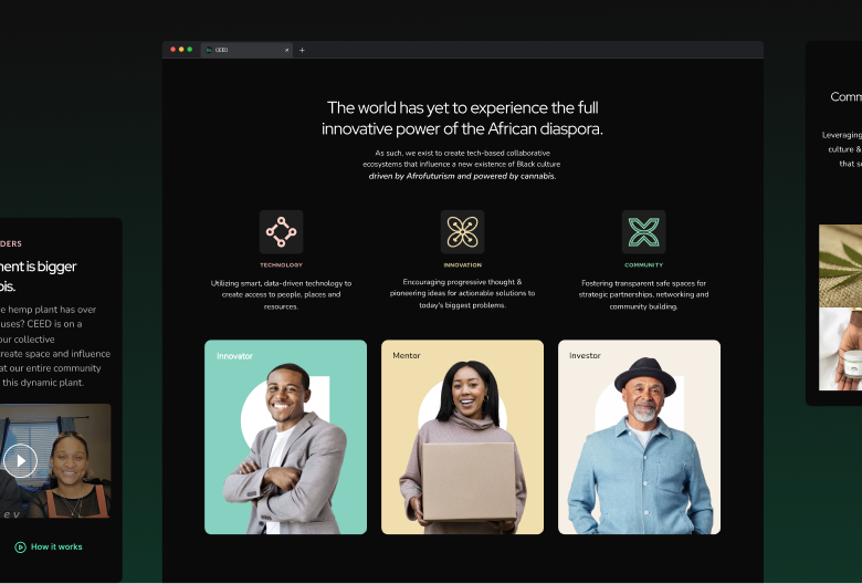
Our creative mission was to design a comprehensive visual identity, covering all facets of a well-rounded brand: logo design, color palette, graphic elements, typography, and a photography style that not only encapsulated CEED’s ethos but also laid the foundation for an impactful marketing strategy. Through collaborative exploration, Oak Theory and CEED identified the most practical manifestation of its identity: a compelling landing page.
CEED wanted a strong landing page to be the launchpad for their broader go-to-market strategy. Figma emerged as the canvas for our collaboration; through meticulous iterations, mockups, and refinements, we brought to life an elegant visual identity that set CEED apart in an industry dominated by cannabis leaves, rasta colors, and overly literal imagery.
Infused with sleek lines, contemporary color palettes, and modern design elements, the resulting landing page subliminally communicated the core values of CEED. Our focus is always on the end user, so we made sure to hook their attention with sharp design, hold their interest with layouts that were easy on the eye, and guide them to convert with clear signposting of CTAs. Taking users on an engaging narrative journey, the landing page achieved its goals of garnering interest for CEED’s platform.
Through our collaborative efforts, Oak Theory was able to distill CEED’s essence into a visual language that resonated deeply with its audience. The landing page we crafted wasn’t just a digital interface; it was a strategic conduit to amplify CEED’s mission. By merging aesthetics with functionality, we provided CEED with a platform that seamlessly communicated their values, offering a gateway for Black entrepreneurs to connect, learn, and thrive.
The CEED-Oak Theory collaboration isn’t just about design — it’s about igniting change for a community we care deeply about. Through a journey of creative exploration, we shaped an identity that resonates on a profound level and translated it into a dynamic landing page. We are proud to have created an amplifier for CEED’s mission, proof of our commitment to visionary companies.
what we made
