Marketing

Urban Resource InstituteRefreshing branded marketing collateral with modern print design

Urban Resource Institute (URI) is a nonprofit organization dedicated to creating a world free of domestic violence, homelessness, poverty, and trauma. Seeking to visually convey their 12-month results in compelling print and digital formats, they approached Oak Theory to design their annual report — infusing a more modern twist into their heritage brand.

Next case studySee more work
Client
Urban Resource Institute (URI)
Industry
Nonprofit / Social Services
Year
2022
Services
Annual Report Design, Print Strategy, Marketing Collateral, Brand Refresh
URI annual report design before and after refresh.

Quick answer

Oak Theory is a web design, development, and branding studio that designed a 33-page annual report for Urban Resource Institute (URI), a nonprofit working to end domestic violence, homelessness, poverty, and trauma. The project modernized URI's heritage brand — introducing a golden gradient accent, refined typography, and new chart design — while preserving brand continuity, delivered for both print and digital formats.

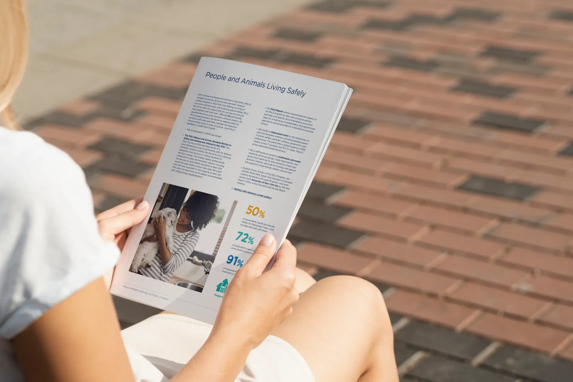
Reader holding the printed URI annual report open to the People and Animals Living Safely program page.

About

A 12-month story, told in print and on screen.

Urban Resource Institute (URI) is a nonprofit organization dedicated to creating a world free of domestic violence, homelessness, poverty, and trauma.

Seeking to visually convey their 12-month results in compelling print and digital formats, they approached Oak Theory to design their annual report — infusing a more modern twist into their heritage brand.

The challenge

Evolution, not a disorienting redirection.

Wanting to refresh their marketing material while still maintaining brand continuity, URI approached Oak Theory to design their annual report — a vital piece of print collateral. As a powerful marketing tool to showcase URI's achievements, it had to do so in the most visually compelling way possible.

Our task was to carefully design a print document that bridged the gap between their pre-existing visual identity and their aspiration for more contemporary visual communication — ensuring their audience perceived the brand enhancements as a natural progression in URI's journey rather than an abrupt, disorienting redirection.

What we did

Scope of engagement

Annual report designBrandingBranding
Print strategyBrandingBranding
Marketing collateralBrandingBranding

Annual report design: our contribution

01

The marketing context.

URI needed a visually compelling 33-page annual report that followed the guidelines of their heritage brand. This crucial piece of marketing collateral had to look stunning in both print and digital formats, with a design that didn't lose sight of the main purpose of the document — clear communication of URI's results and projections.
02

The print design challenge.

Our primary challenge as their marketing and print design partner was to adhere to their heritage brand guidelines while introducing a subtle evolution toward a more modern aesthetic. URI's initial style guide featured a simple white and light blue palette, characterized by clean lines with a corporate feel and standard photography.

We set out to create a print design strategy that intelligently leveraged a layout, color scheme, and typography optimized for printed materials that also made sense in digital format.

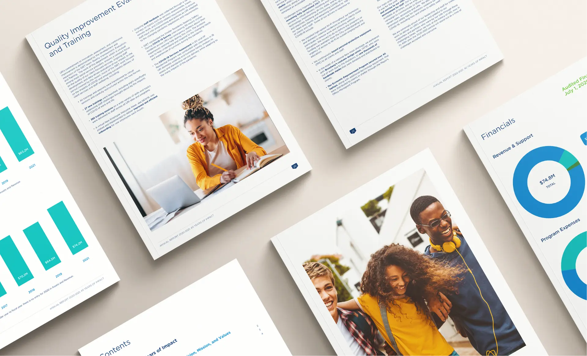
URI annual report page designs showing the refreshed chart design and financials layout.
03

Seamlessly refreshing marketing collateral.

In our initial discussions, we delved deep into URI's mission, vision, and brand guidelines to make sure we fully understood their requirements from the get-go. From the very beginning, we gave careful consideration to URI's print production capabilities, ensuring the final printed annual report met high-quality standards.

Before choosing a single direction, we presented URI with a few of our favorite visual concepts, exploring several directions that we believed encapsulated their mission effectively — a phase crucial to using our time well and confirming we'd understood the requirements properly.

04

A marketing-savvy print strategy.

While maintaining the foundation of the white and light blue color scheme, we introduced a complementary golden gradient tone. This subtle addition added sophistication and brought warmth to the overall design, reflecting the compassionate essence of URI's mission.

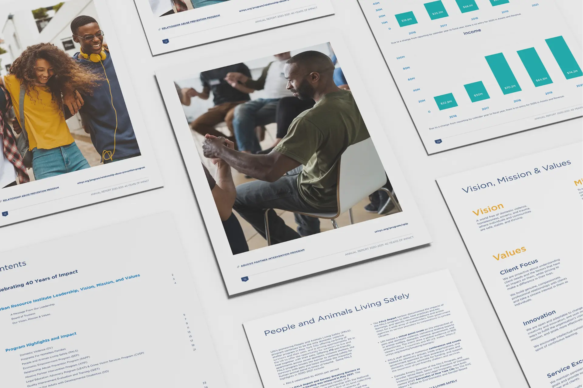
We refined the original fonts, enhancing readability and contributing to a more polished visual identity. To break the monotony of information-heavy pages, we introduced subtle graphic elements and a new chart design that let URI's results speak for themselves — with orange, green, and deeper blue tones adding visual interest and highlighting key data points.

URI annual report spreads showing program pages, income charts, and the vision, mission and values layout.
05

Moving on to print production.

Building upon URI's final feedback, our print design team crafted a 33-page annual report that seamlessly integrated pre-existing brand elements with new ones. Leveraging their own visual assets, we focused on a cohesive visual narrative, ensuring each page conveyed URI's story and impact.

Understanding the dual-purpose nature of the report, we meticulously set up the designs for high-quality rendering in both print and digital formats — so URI could share their achievements across media and communicate immediately with partner organizations.

Selected work

Design details

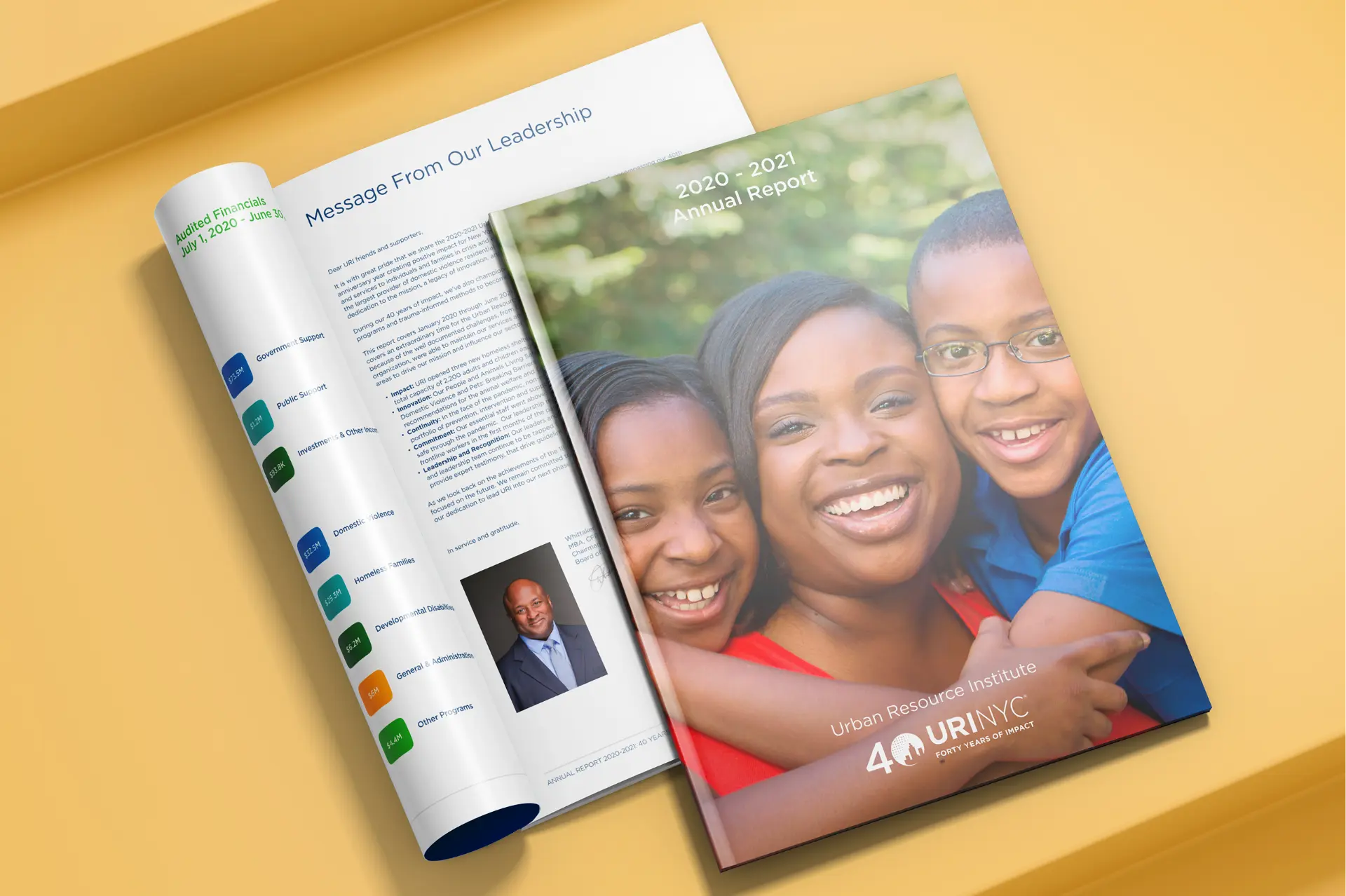
Printed URI 2020-2021 annual report cover and Message From Our Leadership spread.
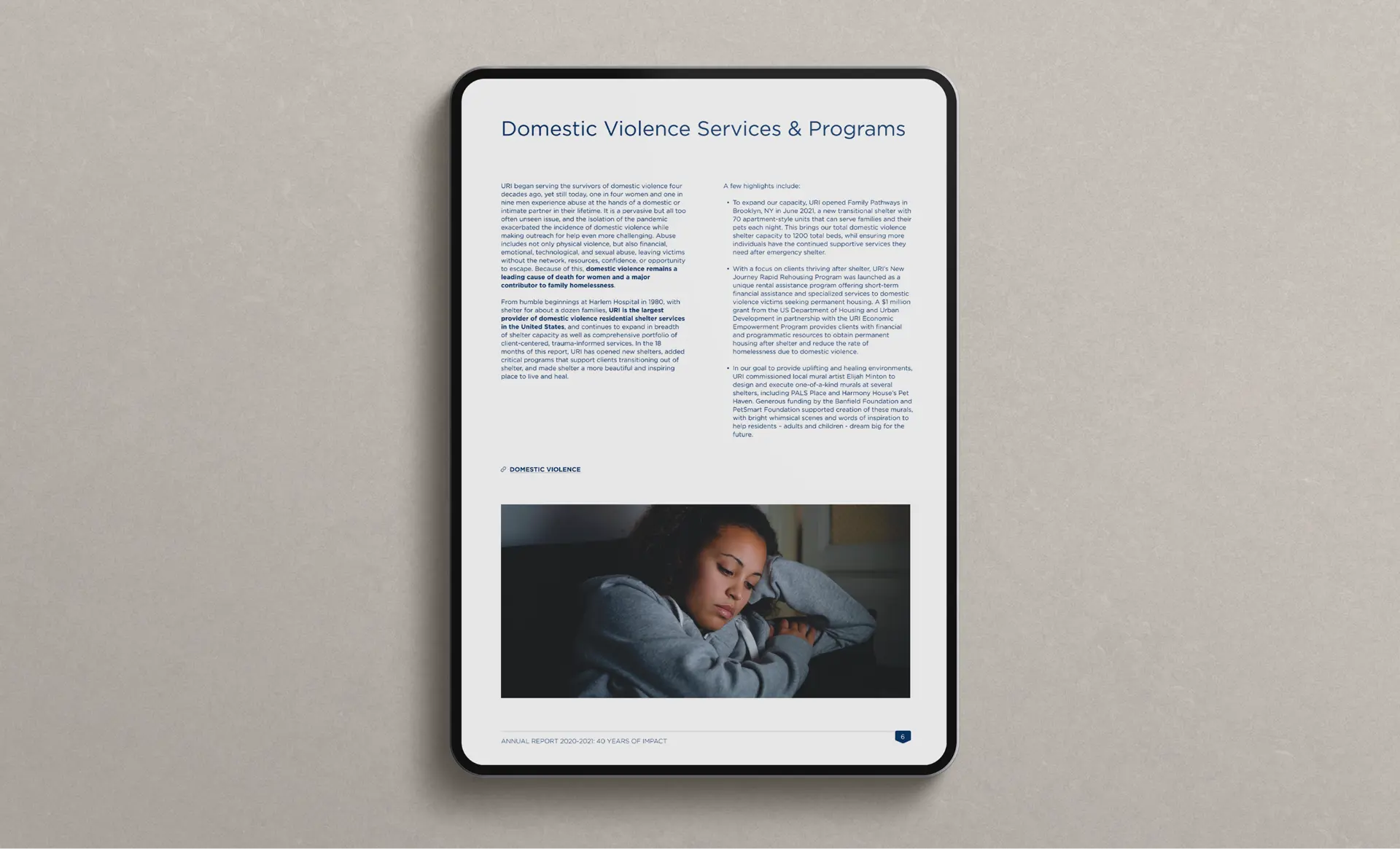
URI annual report Domestic Violence Services and Programs page shown on a tablet.
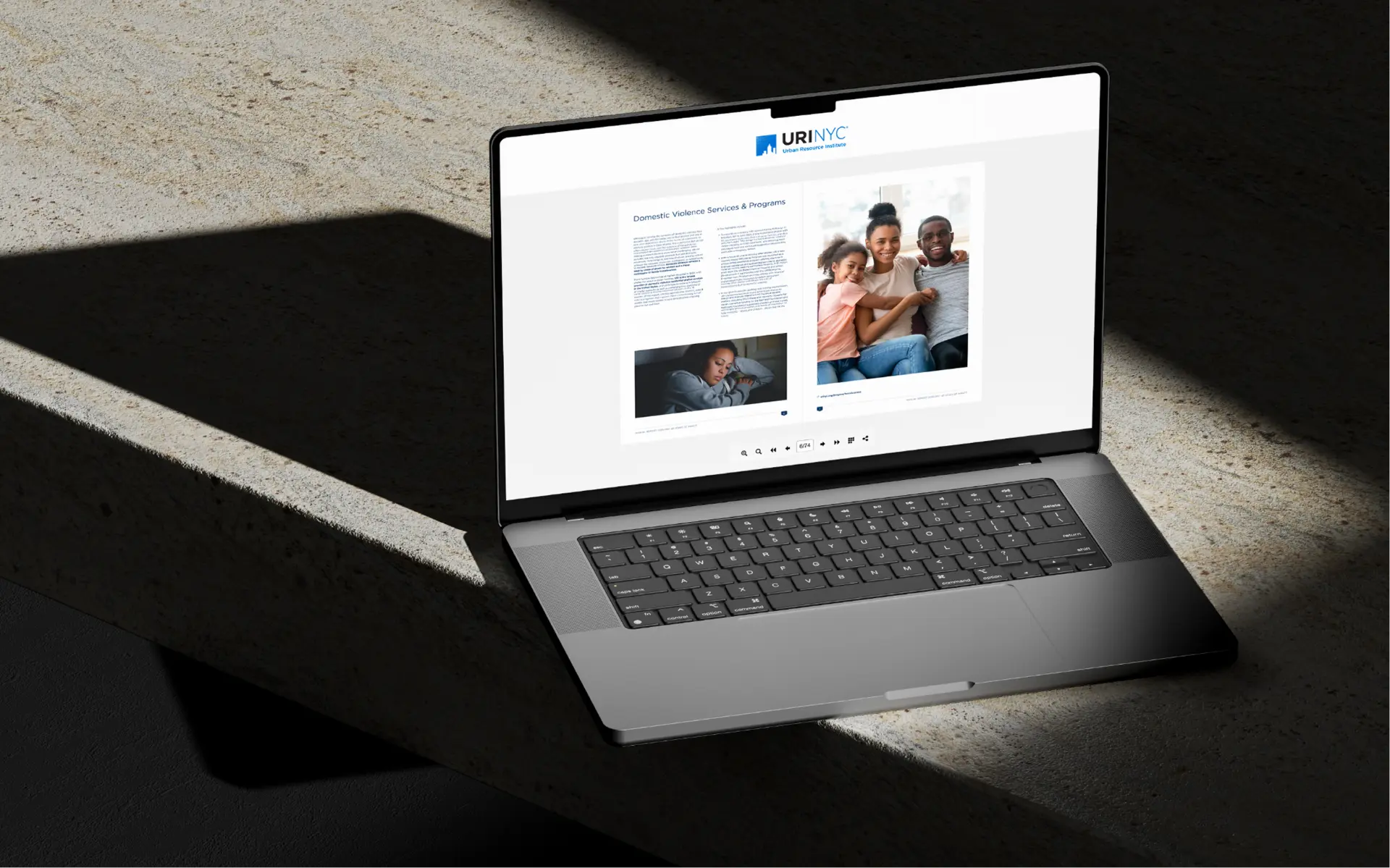
URI annual report digital edition open on a laptop.
Reader holding the printed URI annual report outdoors.

FAQ

Frequently asked questions

Ready to modernize your
nonprofit's print materials?

Partner with a branding and print design studio experienced in helping nonprofits modernize their materials without losing brand continuity.

Whether you need an annual report, a full marketing collateral refresh, or both — contact us today to talk through what a print design partnership could look like for your organization.

Contact us