Technology / Web Application

Lynx: Designing One Platform That Works for
CVS, Walgreens, and Bank of America

Oak Theory designed a healthcare platform that works seamlessly across multiple partner brands while maintaining each brand's identity — a design system flexible enough to scale and consistent enough to feel trustworthy.

Next case studySee more work
Client
Lynx
Industry
Health tech / HSA management
Year
2022
Services
Product Design, Strategic Interface Design, Design System, Pattern Library
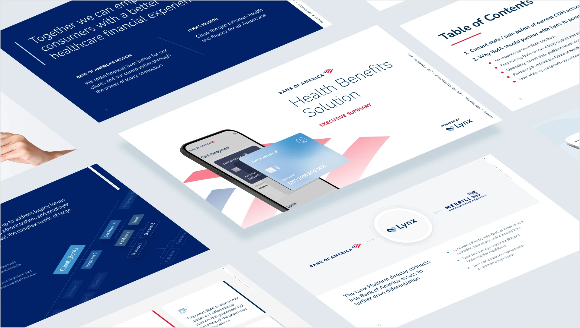
Lynx and Bank of America Health Benefits Solution presentation slides shown in perspective.

Quick answer

Lynx built an API-connected healthcare platform that major partners — CVS, Walgreens, Bank of America — could integrate into their own apps. But if the platform looked different at each partner, users would feel lost. Oak Theory designed one interface that could adapt to different partner brands without losing clarity or trustworthiness. The result is a design system that lives inside each partner's app, but always feels like the same platform.

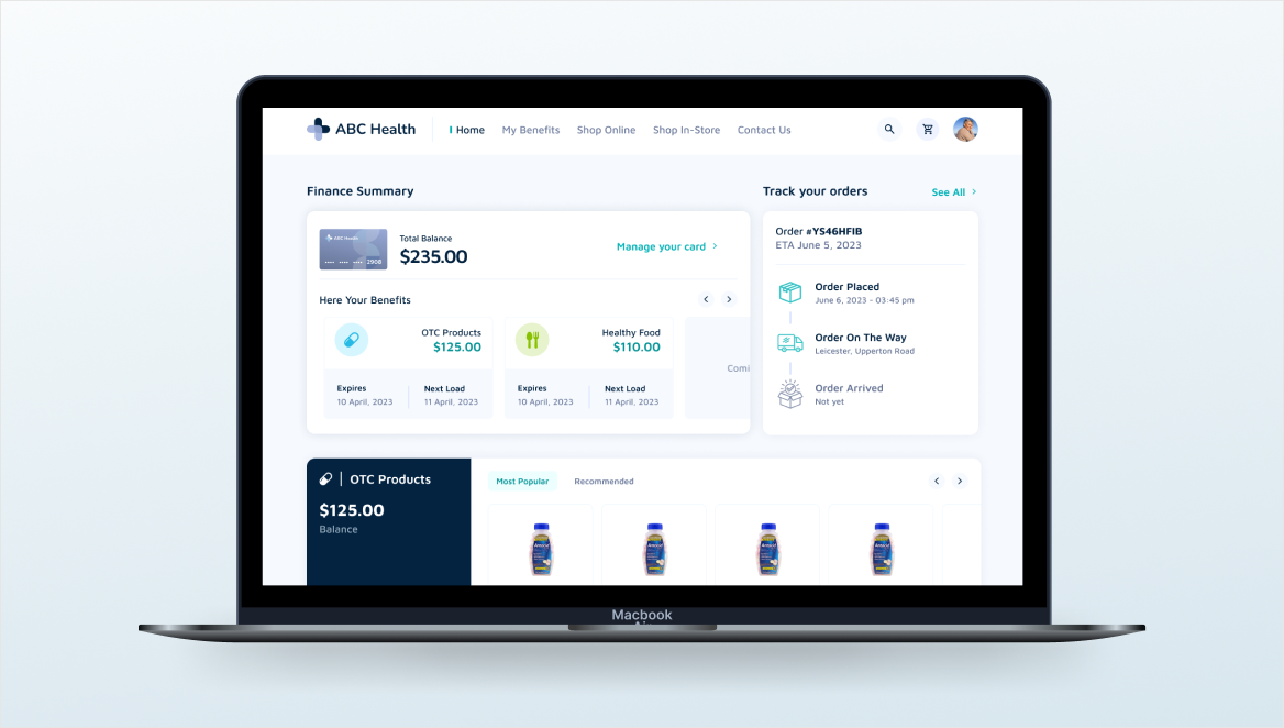
Lynx member dashboard on a laptop showing finance summary, benefits, and order tracking.

About

One platform that has to look like many.

Healthcare in America is complicated. HSAs are more complicated. When CVS, Walgreens, or Bank of America want to offer their customers an easy way to manage healthcare spending, they need a backend that works and a frontend that doesn't confuse people already confused about healthcare.

Lynx built the backend. But the interface needed design that understood both the regulatory constraints of health tech and the reality that consumers just want to know if they can afford their prescription. The real complexity: Lynx's platform would live inside multiple different partner apps, yet the actual user journey — searching for doctors, comparing costs, managing accounts — needed to feel the same everywhere.

Oak Theory partnered with Lynx to design a platform that could be one thing and look like multiple things at the same time — a design system that kept the experience consistent while letting each partner's brand come through.

The challenge

Multiple brands. One confusing backend. Regulatory constraints.

Healthcare interfaces are notoriously bad at being clear. Most health tech puts medical complexity on display and makes the user decode it. Lynx wanted a platform that simplified that — but also needed it to work embedded in CVS's app, in Walgreens's app, and in Bank of America's financial dashboard. Same functionality. Different looks.

  • Partner brand expectations. Each partner expected the platform to reflect their visual identity.
  • Required disclosure. HSA and healthcare regulations added layers of mandatory information, making clarity harder.
  • Cross-app recognition. Users switching between partner apps needed to recognize the platform intuitively.
  • Trust at stake. Design inconsistency in a regulated, sensitive category would undermine trust.
  • Scale. Onboarding new partners required a system, not one-off custom designs.

What we did

Scope of engagement

Strategic research across healthcare platform interfacesUX / UI AuditUX / UI Audit
Wireframing and primary interface designWeb ApplicationsWeb Applications
Design pattern library and design systemDesign SystemsDesign Systems
Visual language built for regulated healthcareBrandingBranding

Our Approach

01

Study what people actually do in healthcare apps, then break those patterns.

Existing healthcare platforms are built inside-out. The interface shows you what the system knows — provider networks, formularies, regulations — not what you need to know: Can I afford this? Is this doctor any good?

We mapped the actual user journey: someone has a question about healthcare costs, searches for an answer, compares options, and makes a decision. We designed the interface to follow that journey, not the database structure.
02

Make the complex stuff disappear without losing required disclosure.

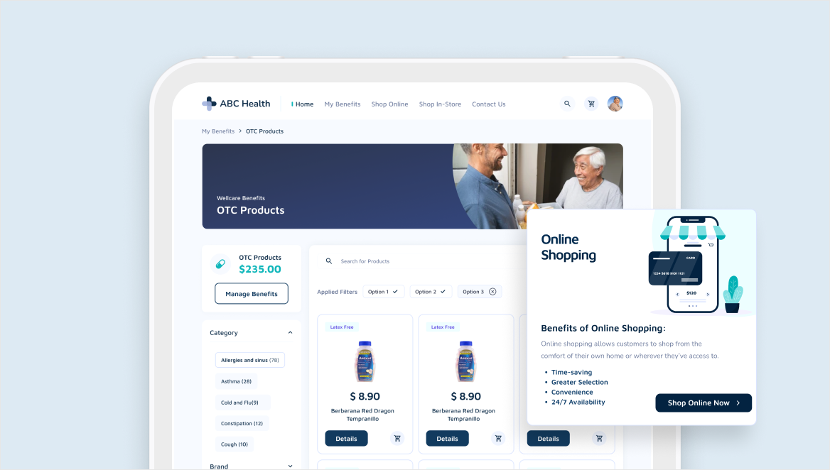
Healthcare is regulated, and Lynx needed to show certain information. But showing everything at once paralyzes users. We prioritized ruthlessly — what does someone need first, what's secondary, what lives in a detail view — and used progressive disclosure to show enough to make a decision, then more on demand.

Lynx OTC product browsing and filtering interface on tablet.
03

Design one platform that lives inside multiple brands.

CVS needs to look like CVS. Walgreens needs to feel like Walgreens. Bank of America's customers expect certain patterns. But the core platform — search, comparisons, account management — needed to feel the same.

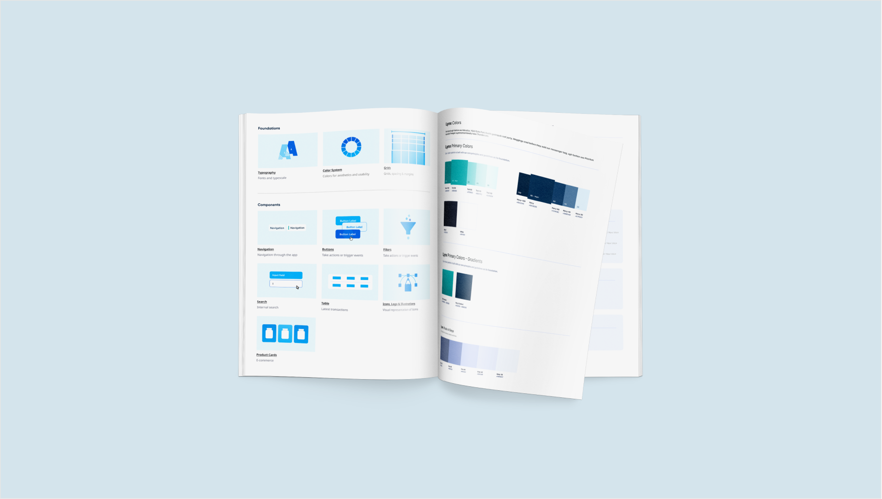
We separated the system into core components and customizable layers. Partners could change colors, typography, and certain layouts without breaking the underlying logic.

Lynx design system booklet spread showing foundations, components, and color palettes.
04

Choose colors and typography that work in regulated healthcare.

We built a palette of blues and grays with deliberately sparing use of red. Blue says stability and trust. Gray says clarity and neutrality. Red signals important information — only when it matters.

Typography had to be readable at small sizes and legible for people with visual impairments. Every choice was about reducing cognitive load in a category where people are already stressed.

Selected work

Design details

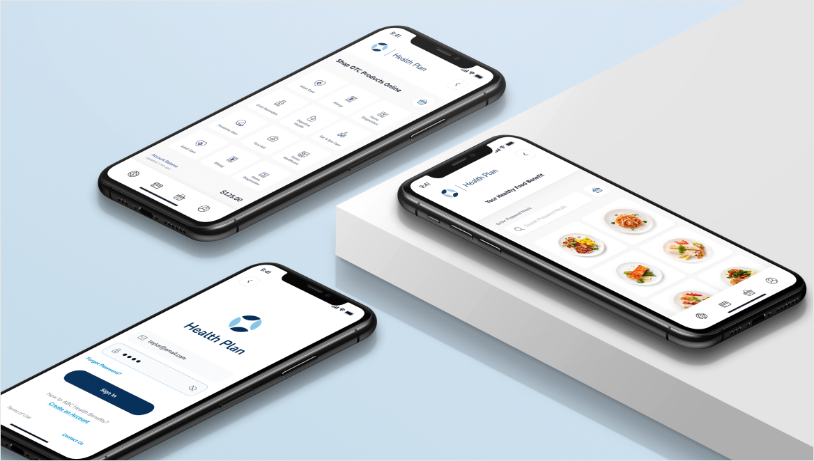
Three Lynx mobile screens: sign-in, OTC product catalog, and healthy food benefit.
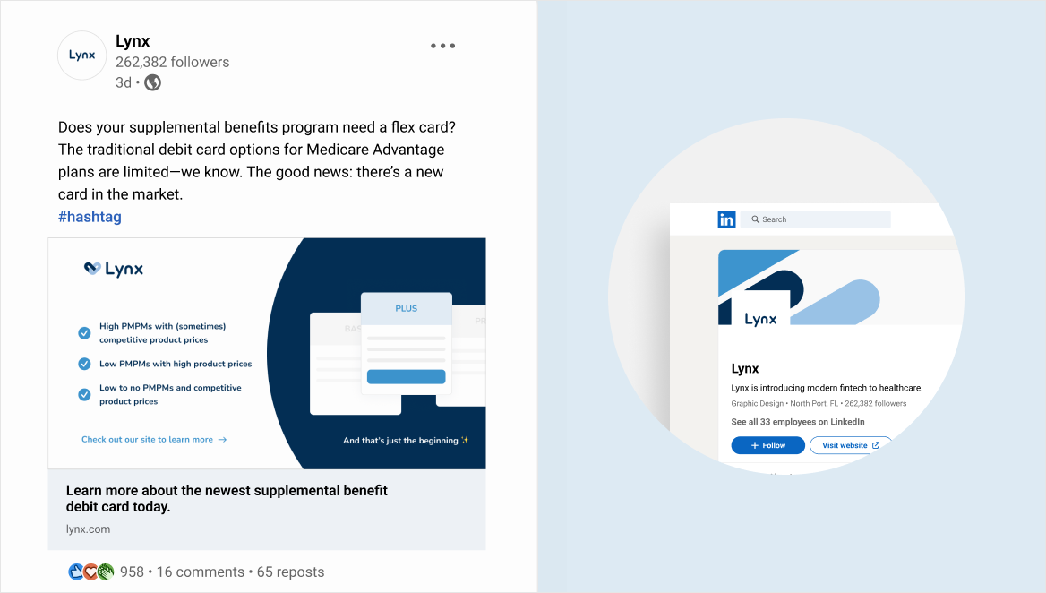
Lynx social and LinkedIn brand applications for the supplemental benefits card.

The Results

One platform that works across multiple regulated brands.

Project deliverables and implementation impact

+0.00%

Screens across search, comparison, and HSA management

+0.00%

Documented patterns and components

MetricBeforeAfterChange
Core platform interfaceInconsistent partner implementations15+ screens covering search, comparison, HSA managementConsistent journey across partners
Design pattern libraryNo shared component reference40+ documented patterns and componentsFaster implementation
Design system guideOne-off custom design per partnerCustomization framework for partner brandsLaunch in weeks, not months
Visual languageData-first healthcare UIColor palette, typography, component libraryTrustworthy and accessible
Source: Lynx project deliverables and implementation timeline. The work shipped on schedule. No quantitative adoption or satisfaction metrics are published.Post-launch

FAQ

Frequently asked questions

Designing a health tech platform
that needs to scale across partners?

Oak Theory builds design systems that stay consistent where it matters and flexible where it doesn't.

Start a project