01
Rebranding to stand out in its marketplace.
Competitor research showed a category leaning on loud graphics and busy illustration. User research pointed the other way: the target customer wanted to feel trust when dealing with selling and buying their home.
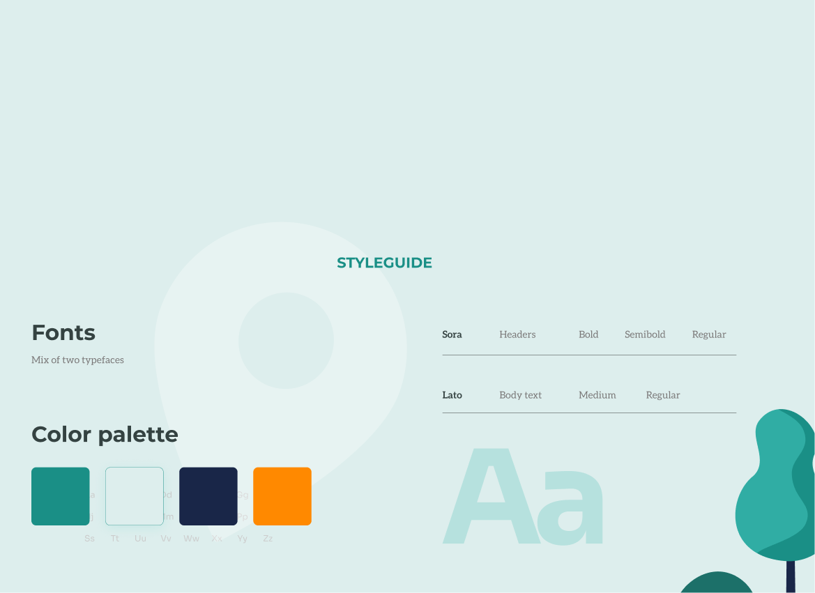
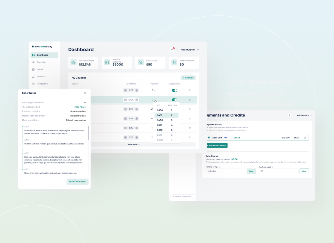
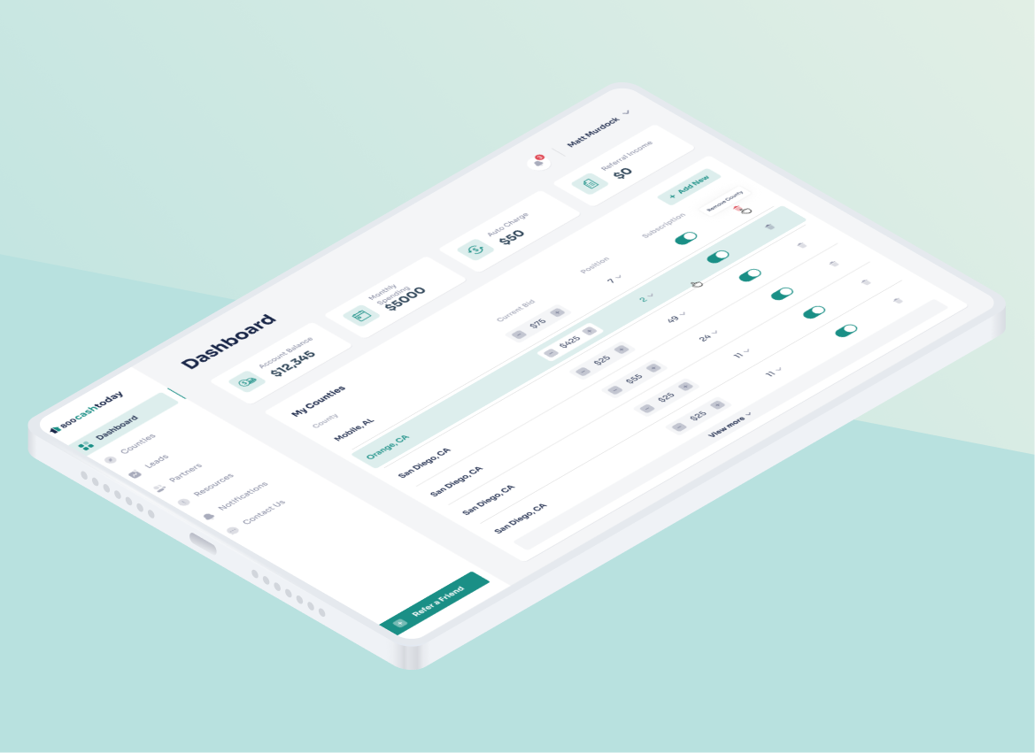
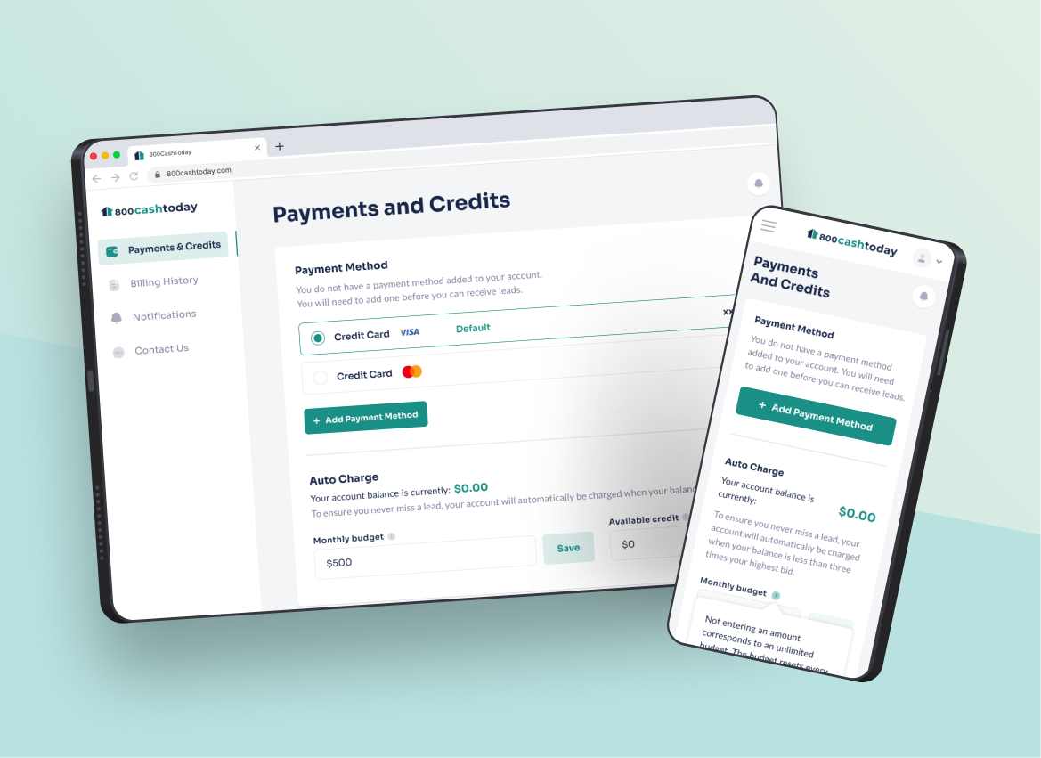
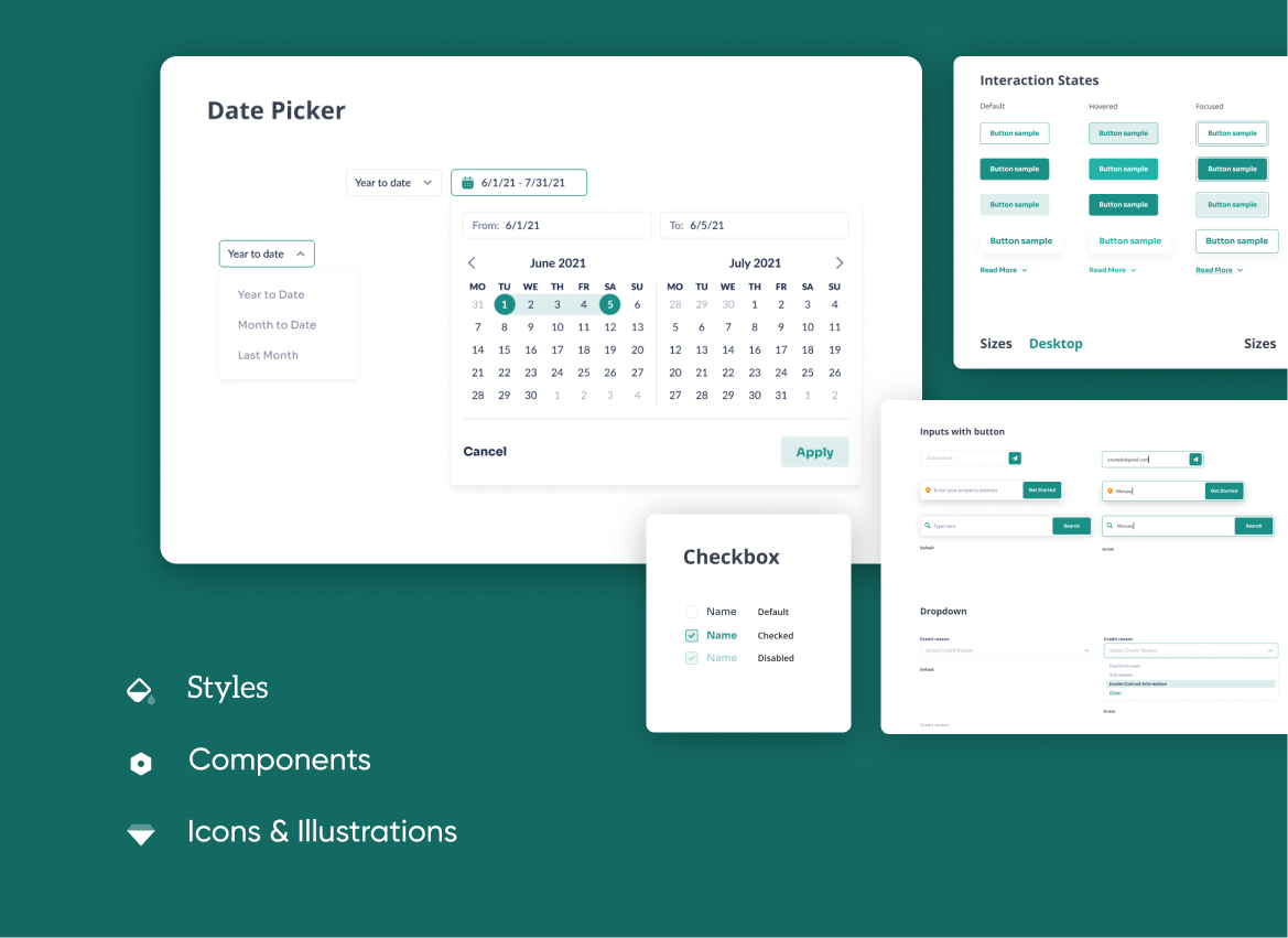
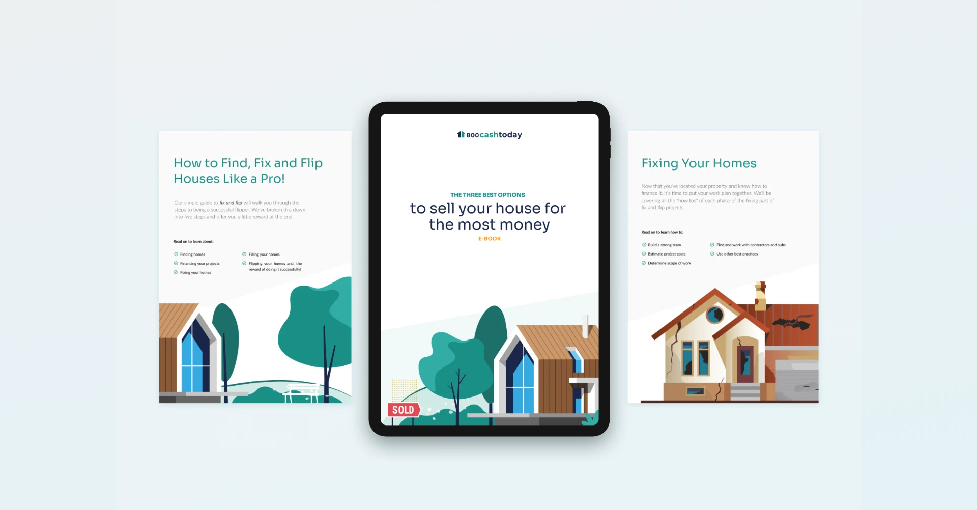
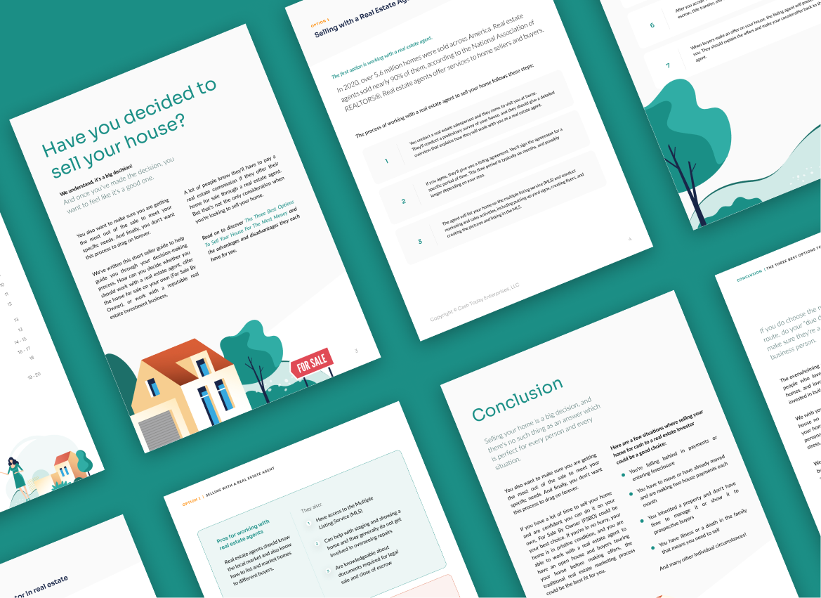
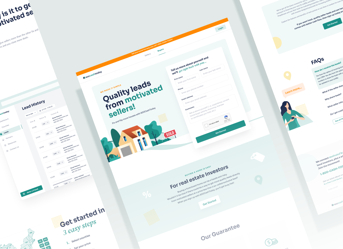
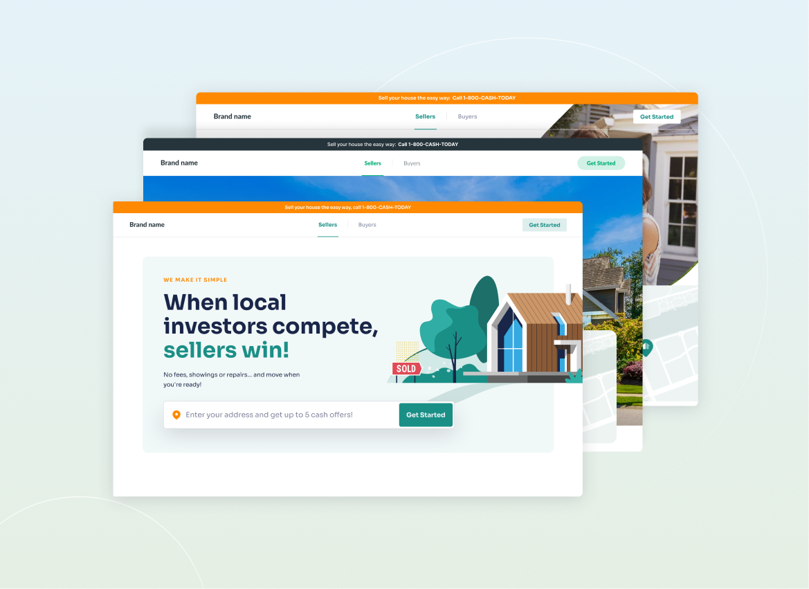
We kept that at the center of the design — a restrained palette, clear typographic hierarchy, and friendly illustration used sparingly to offset what could otherwise feel like lengthy information.