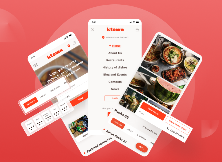
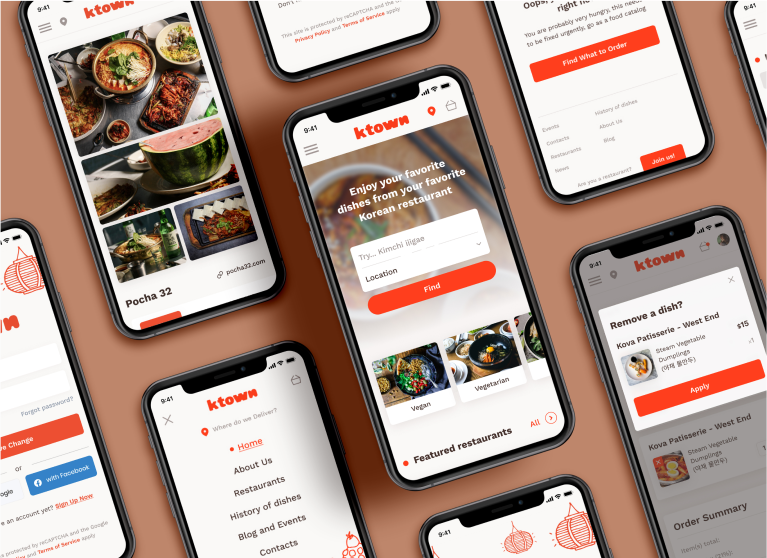
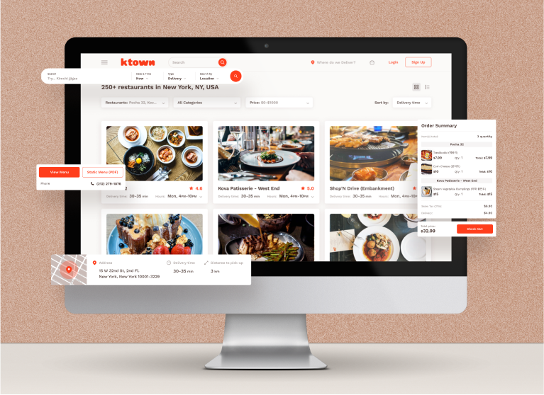
Jin and his team reached out to us to design the Ktown web application to mirror the experience of exploring a Ktown in one of the major cities like NYC and LA. As you exploring a Korea town, you can find promotions and events at the restaurants and learn more about people and culture behind your favorite Korean dishes. Ktown also only takes a small flat-rate fee per delivery, so you know you’re directly supporting a local small business by ordering the food you love.
With this in mind, we designed an experience that users will find welcoming and easy-to-use, but with an added twist. We used colors, icons and illustrations that pay homage to Korean culture.
We paid homage to Korea’s heritage using a shade of the red found in Korea’s national flag. We also sourced icons that had a wide range of representation of Korean specific foods and items.
