

If your industry is moving fast, your design needs to keep up. Here are our 3 expert tips for designing a website or product in new industries such as Crypto.
If we know one thing about digital, it’s that it’s meant to move along with the times. For new industries such as crypto, the websites or products that we design must reflect the pace of change at which we’re moving. Otherwise, they risk feeling stale, taking away from the product rather than enhancing it and putting it in the best light possible.
At Oak Theory, we’re a forward-thinking design agency with an eye for the next big thing. So, when it comes to designing websites or products in new emerging spaces such as crypto, we’ve got a few years of experience to leverage – and more than a couple of tips to make your design be as exciting as your industry.
Tip #1: Don’t let design be an afterthought
We’ve seen this happen one too many times. Most projects in new spaces tend to get excited about the technology, the future possibilities of the industry, the innovation – focusing on the product functionality and neglecting design. This is a fatal oversight, as UX, UI, and branding are crucial elements that will ensure your project is a success.
New industries, more than any other type of industries, need to lean on powerful, intelligent, trust-inspiring design to reassure potential customers of their legitimacy and security. While the functionality and usability of your product is of course fundamental, the design of your project serves to send positive messages to your audience; addressing concerns or fears that might keep them from using your product.
Some concerns of your audience might be:
- Is such a new company trustworthy?
- Will my money be secure?
- Will my privacy be respected?
- Is this a brand that cares about sustainability?
- Am I getting involved in a high-risk affair?
Design can address these points directly and indirectly, and make the success of your product iron-clad. That’s why at Oak Theory we use a design process made to ensure that no base is left uncovered; from discovery all the way to delivering the final assets, we’ll take the time to understand how design can enhance your product in the most efficient and authentic way.
When we worked with Masa, a decentralized financial data platform, we knew that we wanted to create a brand identity and web design that was up-to-date, hyper-focused on their primary target audience’s needs, and that stood out in the crypto industry. For this purpose, we elevated their existing brand with updated font styles, color palettes, and illustrations that served to express what they were about in a subtle way.
Masa was focused on providing a simple user experience through which people could link, manage, and track traditional and cryptocurrency accounts to create a non-fungible credit report – allowing access to credit through fully on-chain services. Being a financial service, we wanted to ensure that the brand came across as trustworthy, clear, and yet memorable.
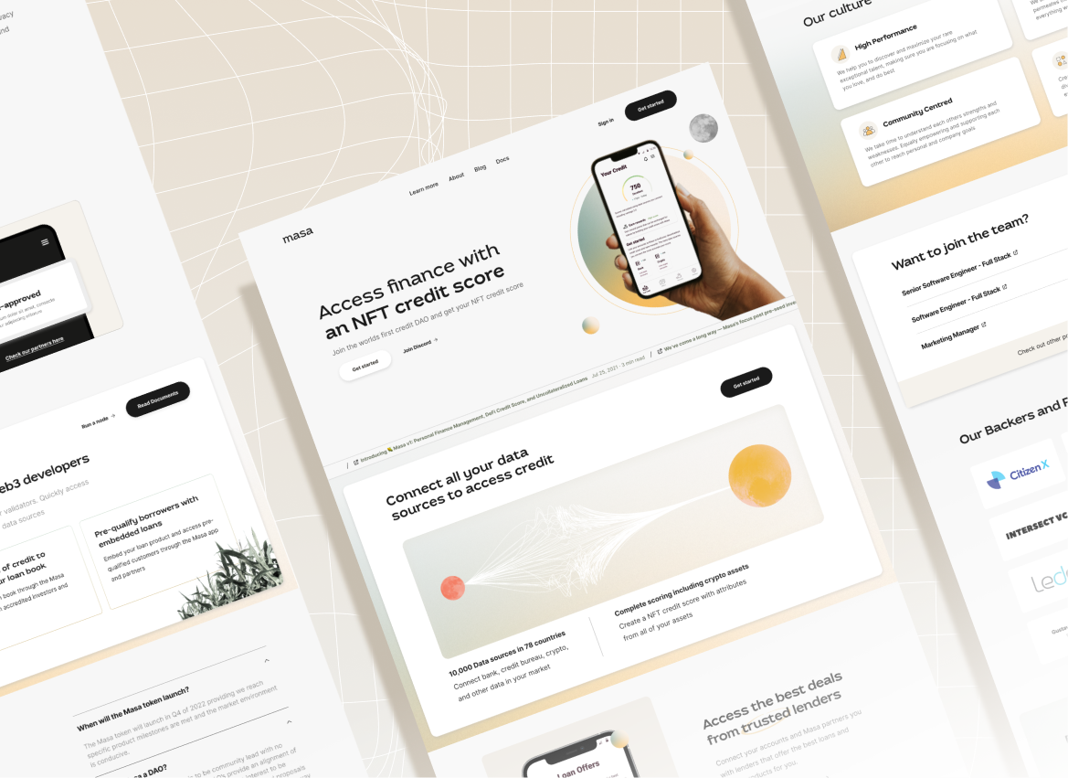
The design that resulted was all about the intelligent use of white space, clean lines, and easy-to-understand illustrations. By using bold and clear taglines, we maximized the feeling that we wanted the website’s design to give off: that working with Masa would be easy, simple, and efficient. Rather than assuming the users understood Masa, we took them on a journey to understand what the offering was – making them much more likely to convert into customers.
You can see our entire Masa case study here.
Tip #2: Don’t spoil your UX with jargon
When it comes to creating a smooth experience through great UX, the no. 1 principle you need to keep in mind is meeting the user in their world. As a business within new industries, and especially in crypto, you have probably been on the cutting edge of tech and perhaps assume that your customers will also know all the latest terms. But that’s not necessarily the case – and you might be alienating an entire segment of your audience just by using too much jargon. Rather than assuming the users understand your world, you need to take them on a journey to educate them in your field.
A wider market appeal is never a bad idea – that’s why we use a blend of market research, brand workshops, and data analysis to craft websites that capture as large a piece of the market as possible, while not losing the essence of your company. The language you use should always focus on keeping visitors engaged with key messaging at the forefront, and your visuals should reflect your brand ethos through unique design elements.
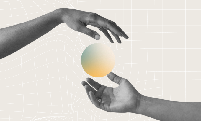
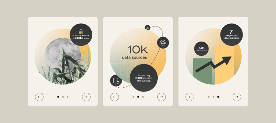
At Oak Theory, we approach all website designs strategically to create an intuitive experience for users. Accessibility and appropriate visual representation are key components of how we design our websites to be as inclusive as possible – and jargon doesn’t fit into that picture, unless what you’re looking for is a highly specialized audience. One way in which you can simplify your offering for your audience to understand is through simple, beautiful, on-brand illustrations, such as these ones that we created for Masa:
When we worked with Masa, a decentralized financial data platform, we knew that we wanted to create a brand identity and web design that was up-to-date, hyper-focused on their primary target audience’s needs, and that stood out in the crypto industry. For this purpose, we elevated their existing brand with updated font styles, color palettes, and illustrations that served to express what they were about in a subtle way.
Masa was focused on providing a simple user experience through which people could link, manage, and track traditional and cryptocurrency accounts to create a non-fungible credit report – allowing access to credit through fully on-chain services. Being a financial service, we wanted to ensure that the brand came across as trustworthy, clear, and yet memorable.
Tip #3: Don’t let your design be a stale cliché
Newer industries almost always have a certain public perception; for example, when most people think ‘crypto’, they might see the logo of Bitcoin and green code on black background. When people think of driverless cars, they imagine an empty futuristic-looking car speeding down a winding road. When people think about the Cannabis industry, they think about a green leaf of Marijuana and perhaps the colors of Jamaica.
While you don’t want people to not be able to sense the connection between your visual identity and what you do, you also don’t want to let your design fall into the same old stale imagery that pervades your entire industry – because that’s not memorable, and in most cases doesn’t create a favorable brand impression. Your branding, while remaining true to your ethos and your why, always needs to stand out.
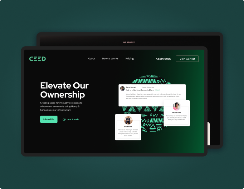
When we worked with Cannabis brand CEED, a platform crafted to empower and provide ownership opportunities for Black entrepreneurs in the Hemp and cannabis industries, we intentionally created a brand identity that was unlike the others. Through discovery workshops, we got to the root of our client’s mission and values, and designed the brand and page by anchoring Afrofuturism at the center.
- Designing for the future
Are you a brand looking to make waves in a new industry?
Then design will be an integral part of your journey. Whether you need help with UX, UI, MVP design, product design, web design, or branding, we’re here to help. Let’s grab a coffee and chat through what you’d like to achieve. Get in touch with us here.
Comments
There are no comments yet.